Harmonious connection in Elsternwick renovation
It won multiple awards yet there is something missing in the restored and extended three-bedroom Federation villa on one of Elsternwick’s most handsome period streets.
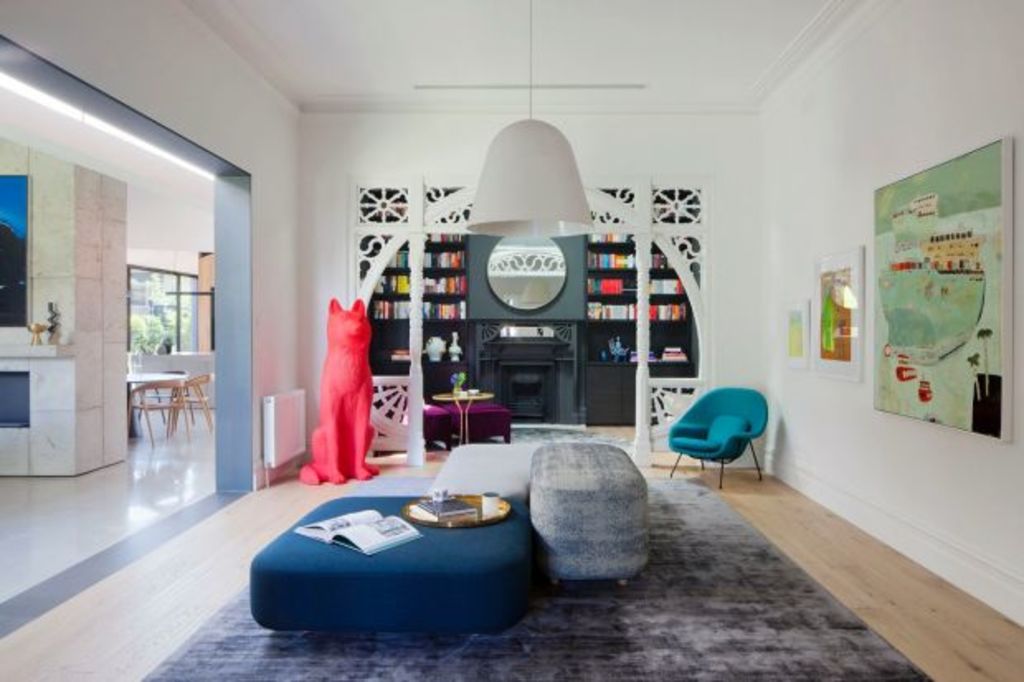
Touring the four metre high rooms of the 1906 home, with its exceptional wooden fretwork featuring above doors and between sections of the once formal front room — now used as an art gallery by collector owners — and the airy new spaces, architect Matt Gibson ‘fesses up.
In a house where the addition has bought a dim old home into the north light available at the rear, the progression through time feels natural despite the then/now gap of 110 years; despite oak floors giving onto polished concrete, and corniced ceilings moving into spaces with faceted pitching, folding and high roof forms.
“It’s a constant meandering movement”, Gibson explains. “There is always this sense of meandering. There is never a sense of ‘clunk’.”
According with best heritage practice (and “Shadow House” won both a heritage award as well as one for best alterations and additions in the 2016 Victorian AIA awards), the distinction between old and new is starkly apparent.
Original is red brick, square, merchant-class grand. The single level addition which curves like a cupped hand around it, is black zinc outside, and internally is white plaster, Blackbutt timber, concrete – including a rough cast concrete chimney “monolith” that separates formal from informal dining spaces to become yet another great place to hang interesting canvases.
The dividing line is indicated by a 600 millimetre wide strip of roof glazing that completely separates the buildings just below the eave line, and delivers light from one of many new overhead skylights.
Council planners initially wanted the floors to be just as distinct by insisting on a step down into the addition. But Gibson argued for maintaining the on-the-level flow-through.
“We haven’t tried to connect or confuse the heritage architecture because always, the original stands as a clearly red building around which the dark-clad addition has been wrapped”.
A great deal has been added and it always engages. For instance, in the one internal black zinc wall that runs into the building from the outside, a panel opens into a totally unexpected guest suite. Walls of glass open up for metres in all different directions, delivering not only cross ventilation but an uncanny feeling of a domestic space that can become an extended interstitial zone that is neither in nor out but in a sense, and like the most luxuriously appointed patio, a part of both.
Gibson credits dream clients for the fact that he pulled off such an impressive if complex project. But due credit to the highly skilled architect long practised in bringing inner city period homes forward into contemporary relevance.
As Gibson notes, “nothing has been added that feels out of sync from what we started with.”
Every element is a small excellence, including the long, bevelled concrete steps off the back deck as just one more incidentally delightful detail.
More subtly is the flawless proportionality of scaling. “Composing space and sizing is hard work”, says Gibson, “but over the years you get to know how to do it.”
The client agrees: “The proportions are absolutely perfect because everything feels so spacious yet also so comfortable.”
We recommend
We thought you might like
States
Capital Cities
Capital Cities - Rentals
Popular Areas
Allhomes
More
