Historic Dawes Point terrace rediscovers its colourful past
Architect William Smart has a theory that people stick to beige colour schemes “thinking that longevity and enduring design means being neutral”. To his mind “longevity is about not following fashion”.
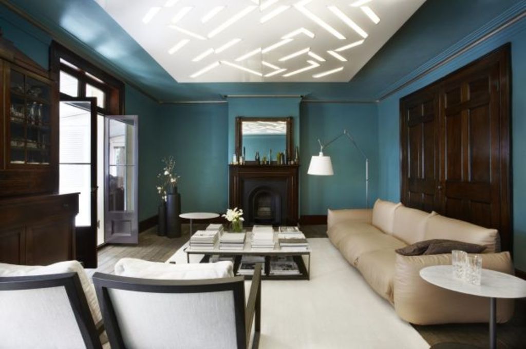
In an outstanding interior project he and his Smart Design Studio colleagues orchestrated three years ago in an 1832 Dawes Point property that has convict tool-etched sandstones in the basement, a jewel-like paint job has been effected in every room, save the small salon where the fragments of a period wallpaper were kept and sort-of restored.
“The wallpaper is beautiful,” he says. “We treated it like a Grecian vase that had cracks in it.”
Otherwise, with the encouragement of owners enthusiastic about the colours in a chart from a British heritage paint company, the restored rooms of the once derelict former harbour master’s house display fearless colour choices.
But, as Smart explains, the red dining room’s “Glowing Coal”, the basement kitchen with the apple green staircase, and the deep turquoise sitting room with harbour views, restored red cedar, “and a really low ceiling, are how the house wanted them to be”.
The owners had handed the architect the Farrow and Ball chart, which he took “as a clue to be creative with colour”. But as well as acknowledging that Victorian houses did often have highly colourful interiors, most of the shades were suggested, he reckons, by the rooms themselves. A scrape back on the kitchen stair, for instance, revealed the apple green Smart believes “could be 100 years old”.
Though the project was completed some years back, it was only recently photographed because finally, all the right furniture was installed alongside new installations such as the stark white Corian kitchen island, and the glossy white ceiling square with the chevron cutouts that illuminates that shallow-ceilinged blue room “like an artwork”.
To Smart, the still fresh appearance of the scheme “proves the point about the longevity of appropriate colour”. He says revisiting the house “has reinspired me. I actually had a ‘wow’ reaction”.
It has also reconfirmed that “beige really can be the hardest colour to live with because it can look so boring and so insipid so quickly”.

Dawes Point house, by Smart Design Studio.
Of course, doing the big main colours led to much work to match exactly the right shades and contrasts for the ceilings and cornices. The red dining room has a pea green ceiling and gold trim incised along the cornice. The turquoise room has pewter as an accent.
The kitchen has the apple green working with a matt shade of Frog Hollow … “what the room wanted to be”. Besides, he adds “it was fun to do”.


We recommend

States
Capital Cities
Capital Cities - Rentals
Popular Areas
Allhomes
More
