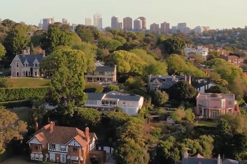
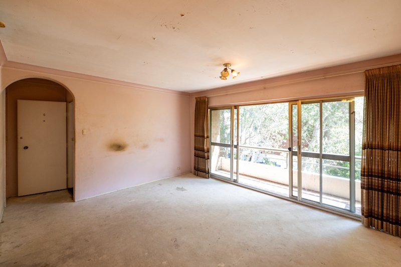
Imposing Kirribilli semi gets a cool makeover
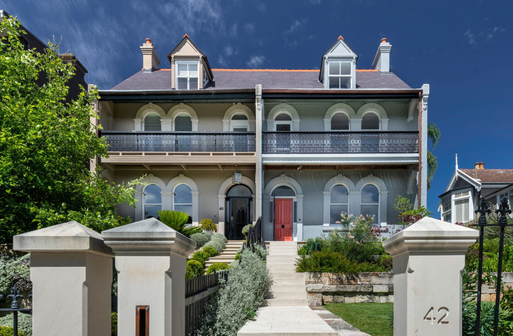
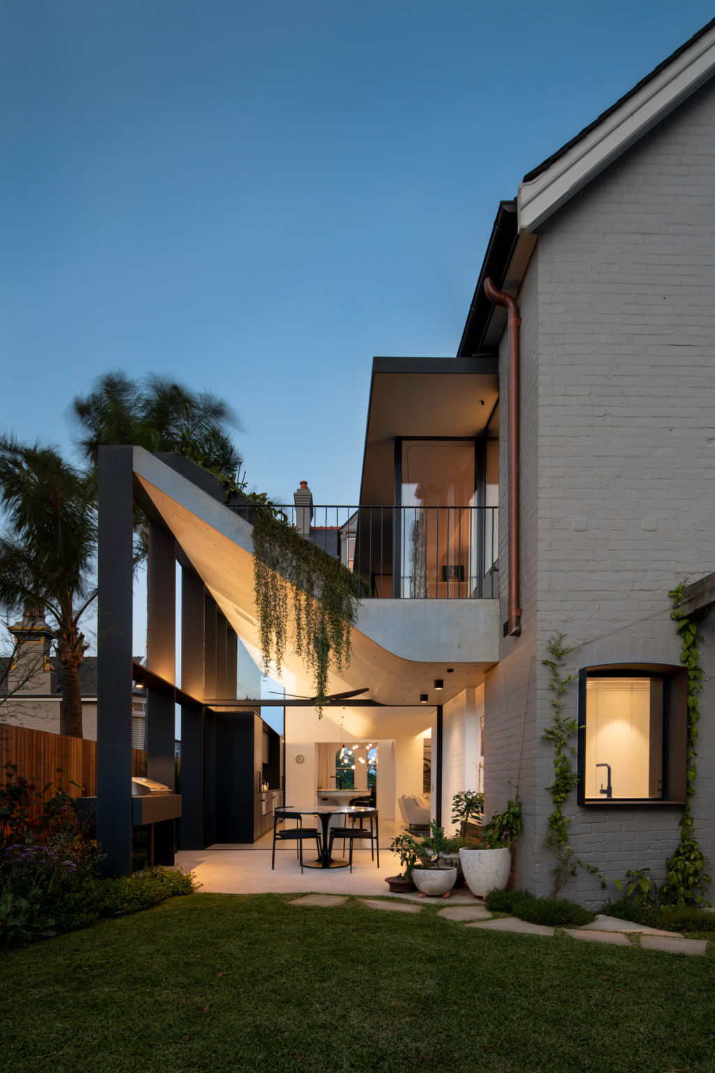
Kicking out and upward from the side of a handsome 1880s semi in Kirribilli, a new roof form works for many purposes but mainly as a light-catching device.
And wow. What quality of Sydney daylight it draws into the new kitchen with its pale concrete floor, concrete and curvaceous island bench, and the uptick of that roof formed in concrete and covered – on its domestic underside – with plaster.
“The light is phenomenal,” says Steve Koolloos, director of MCK Architects. “The light changes the spaces in the way it comes in through the day. There are moments when it is frantic and moments when it’s calm.”
He calls the ceiling that is quite low and compressing above “the fixed furniture piece of the sculptural, aquamarine granite-topped bench before it rises into the light — a sensation. It’s theatre.”
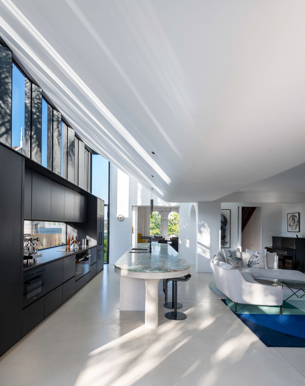
For visual contrast, a heavy element – “the blanket of concrete” – is supported on a sequence of slim, dark, plate steel blades “to make a juxtaposition of a light structure with the heaviness of the concrete”.
While the roof is the main marvel of a substantial addition to a double-storey, double-brick house and allows the amazing innovation of a sloping garden planted outside the children’s upstairs bedrooms, it was not about architectural statement-making.
Koolloos explains how his studio, in its concentration on high-end bespoke residential, “designs from the inside out to get the right spaces. We then deal with how they look externally.”
He often finds that what emerges from prioritising function and interior experience over form can be quite a surprise.
This old semi that has a history as a boarding house has many surprises. One is a long study space that has been snuck into the roof cavity on the way to the third floor, accessible via a narrow and slightly triangulated doorway.
The attic guest bedroom has gained a new bathroom, and the pastel-hued staircase carpet, featuring more triangles, was custom-designed.
In a home that has respected the formality of grand front rooms, often with gorgeous plasterwork detailing on some ceilings, there are also many injections of fun as other successful juxtapositions of the antique with the contemporary.
It starts at the front door, painted galah pink and with a black dot handle in deference to visiting birds.
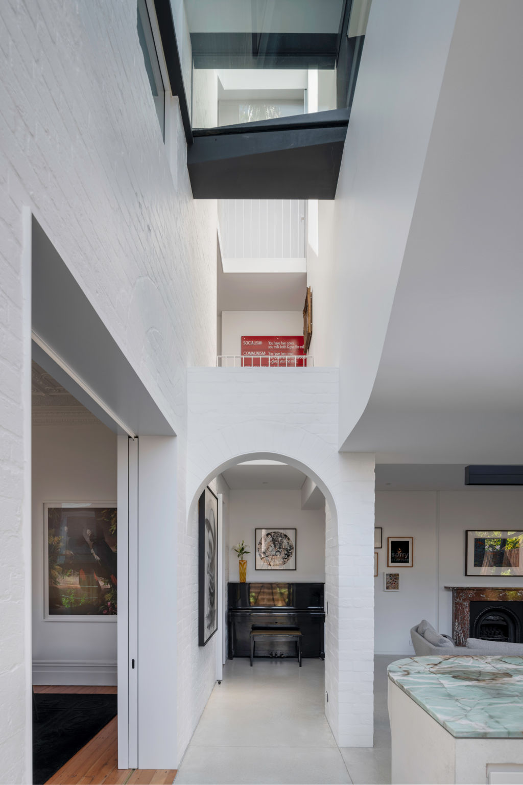
It continues through to the transition from original to introduced spaces to the narrow atrium Koolloos calls “the pause” because with glass roof and having all three levels in view, “it causes you to slow down and look up.
“It’s a nice moment where you can understand the height and verticality of the house.” The architect can envisage the open balcony above the arch being used by a speechmaker at special occasions.
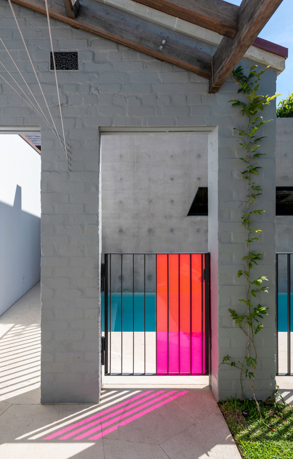
The fun which Koolloos considers apt to a suburb that he sees as having held onto a bohemian aspect of its character – “it’s not Double Bay” – continues through to the backyard where a drying line has been made to support climbing plants as “the clothes vine”. The gate to the pool is covered in a frivolous colour of pink acrylic.
The pool, initially slated for the roof of the garage but moved down into the garden to be more practical, is not really for doing laps. At seven metres by 2.5 metres, “it gets the kids wet”.
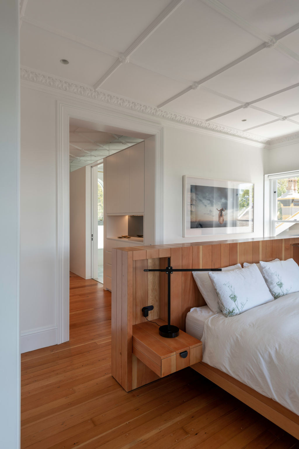
The effortless and ever-present melding of different design eras is exemplified in the main bedroom suite. Consider the clerestory windows between bedroom proper and en suite where the glass has been etched around detailing of the plaster ceiling.
Consider how the squared marble vanity in the ensuite not only extends into the shower stall to become a handy shelf for shampoo bottles but that the shelf above the handbasin is actually the mantle of an original marble fireplace.
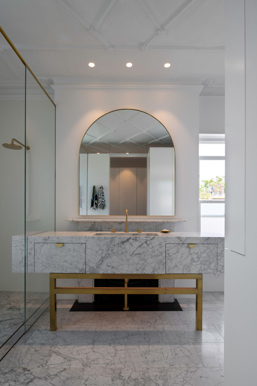
The fireplace is still there. You can just see its arch opening beneath the vanity. “Our strategy,” says Koolloos, “was to create a sense of reversibility so that in the future, you could reinstate it.”
He says the completeness of the realisation of this very impressive project reflects “the trust and quirkiness of the clients and the wonderful heritage of a semi in Kirribilli.” For MCK, the house called Taroela was “a very fortunate canvas”.
We recommend
We thought you might like
States
Capital Cities
Capital Cities - Rentals
Popular Areas
Allhomes
More
- © 2025, CoStar Group Inc.
