In with the old and in with the new
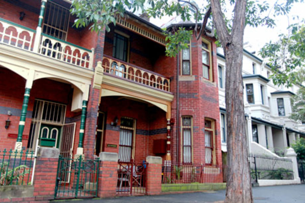
This stately house in Potts Point was originally designed as a “gentleman’s residence”. Built in 1903 for a former lord mayor of Sydney, William McElhone, the sprawling Federation-style house overlooks the harbour and leafy streets.
Owner Patrick Gill bought “Heatherdene” in 1993 and regularly hosts friends visiting from Queensland, where he lived previously. “It was quite run-down when I bought it,” he says. “Most of my friends thought I should just gut it and start from scratch.”
Fortunately, the heritage-listed house, spread over 2½ levels, wasn’t stripped to its fine bones. Rather, Gill lovingly restored the house himself.
At first, he was going to convert the scullery, now used as a living area adjacent to the kitchen, into a new kitchen.
“Patrick thought the open fireplace [in the living area] would create a focal point for a kitchen,” says the director of Kennedy Associates Architects, Steve Kennedy. “At that stage, he was thinking about scalloped timber cabinets that would suggest the past.
“It wasn’t just the design that seemed inappropriate, it was also the scale of that room, approximately four by four metres.”
Side entry
Another issue was what to do with the double-height space leading from the side entrance, which was designed for servants.
“The arrangement might have been appropriate for the early 1900s but most people don’t want to be greeted with a toilet as soon as they walk into a home,” Kennedy says, recalling the laundry and toilet, which was exposed to the side entrance.
Rather than treat the laundry and kitchen as separate entities, Kennedy convinced Gill that the two areas should be treated holistically, with a staircase and joinery elements read as one.
Immediately inside the entrance, the laundry has been enclosed with spotted gum timber doors. There was also sufficient space for a wine cellar.
“Patrick is conscious of the building’s history. There were things he was reluctant to remove,” Kennedy says, referring to the original toilet, which has been retained as a relic behind the new laundry; however, it isn’t in use.
Kitchen
Timber treads, made from tallowwood, lead to a new galley-style kitchen. And to make the design appear as a part of something larger, the staircase is integrated with the joinery separating the kitchen from the entrance.
The kitchen includes two-pack painted cupboards along one wall, concealing appliances such as the fridge as well as the pantry. “It’s a much more generous space than the old scullery. And it’s considerably lighter,” Kennedy says. The scullery has been retained, along with the fireplace, and is now used as a breakfast and informal meals area.
To maximise space in the kitchen, Kennedy included shelving behind a green splashback. On the opposite side of the kitchen is a built-in island bench, which includes timber draws for large pots and pans.
And rather than dotting the ceilings with light bulbs, there is just one fluorescent pendant light over the island bench.
“The kitchen appears quite simple but it was actually quite a complex design, treating kitchen, staircase and laundry as the one form,” he says.
“We were fortunate to work with a void [about 4½ metres] that allowed us to include all of these.”
History
Mindful of the house’s heritage, Kennedy Associates retained all the external brickwork, including the original windows. Even a striking arch framing the side entrance was retained – it now features a glazed door. “It was quite an economical solution,” Kennedy says.
Ironically, Kennedy was initially commissioned to design an attic-style library. “We started to design the library but the focus shifted when Gill started asking our opinion on the old-fashioned scullery-style kitchen he was planning,” says Kennedy, who still has the library on his “whiteboard”, pending his client’s instructions. “There’s nothing wrong with staging things. And the kitchen is a core element.”
Gill adds: “It is a contemporary and minimal kitchen. But we’ve retained all the skirting boards and doors.
“It’s not a jarring experience walking from the past into the present.”
Aim
To insert a contemporary kitchen, laundry and staircase in a 20-square-metre space that responded to the heritage house while addressing contemporary needs.
How long?
One year to design and build.
Favourite features
The kitchen feels considerably more spacious than it is and the views over the neighbourhood.
Insider’s tip
Be clear on what you’re trying to achieve from a space. Sometimes, it’s better to focus on less and achieve a better outcome.
Green points
Recycled timber used for the kitchen and laundry joinery.
Exterior of the building was fully preserved.
Minimal lighting – one fluorescent light.
Architect
Kennedy Associates Architects, 9557 6466.
We thought you might like
States
Capital Cities
Capital Cities - Rentals
Popular Areas
Allhomes
More

