JFK Design on making more space in one of Melbourne's tiniest houses
There is a smaller house in Melbourne than this 3.2 metre wide Victorian brick cottage. It’s the famous 1870s weatherboard pre-fab in Collingwood, “the Doll’s House” that at 2.5 metres wide once accommodated five people – at the same time.
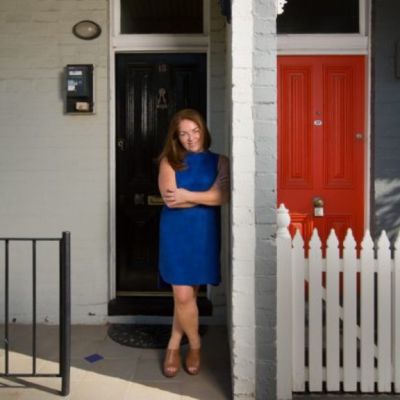
There are a few other period dwellings just as site squeezed. We know this because they’re the three neighbouring houses developed as a terrace of the tinies in the terrifically expensive residential streets of old South Melbourne.
This little west-end-of-row house that has just undergone a fulsome renovation and extension at the hands of building designer Jackson Fitzroy-Kelly, or JFK of JFK Design, was, he says, “bought by the owner about four years ago as the smallest and cheapest house she could find in South Melbourne”.
When he approached the project, JFK found the usual three front rooms within the original brick walls – including “a sliver of a terrible second bedroom only 1.8 metres wide” — plus the usual tack-on additions of laundry, bunkroom and bathroom running into the pocket-handkerchief backyard.
He also found some bonus metres, because in a very eccentric subdivision, the block bellied out in its mid-section to 3.4 metres before tapering again to the 3.2 metres at the back fence.
How do you tackle something as undersized as this and still make it habitable?
“By pushing back on all the constraints and limitations,” he says. Super small houses are the projects that exercise architects and building designers the most. “They take a lot more effort to get them to work out”.
JFK got this one sorted by gutting the lower floor, removing all the internal walls and making it into a boundary-to-boundary living space that starts at the old timber-floored front room — now the dining area, steps down 300mm onto concrete — a move that makes the kitchen bench “like a piece of furniture, and gives more headroom both upstairs and downstairs”.
The public quarters slide between the timber-veneered kitchen cabinetry “that is deep to contain a fridge, the pantry and the washing machine”, and the open-backed staircase that is part of the support structure of the upper floor and “that takes up one-third of the room”, to the sitting space.
From the steel divisions of the bi-fold windows at the northerly-oriented living area, the sight view line runs clean through the building to the French doors at the front “and then right across the wide street if the front door is open”.
“Seeing right through the place is the way to make it feel bigger,” says JFK. Making the decor of the rear feel industrial was the way to make it feel contemporary, he adds.
Upstairs is the bathroom, a study nook and two bedrooms. The master at the rear is a very decent 3.8 by 3.2 metres, with wardrobes and drawers made from Oregon timber recycled from the demolition of the original building.
Upstairs, the ceiling heights vary from three metres down to a lower point over the small landing lobby. But with a long and large skylight over the stairwell washing daylight down the walls and bouncing it through the building, natural illumination is the fourth dimensional strategy that goes a long way to mitigating any sense spatial stinginess.
“The light,” says JFK, “is one of the big keys to why such a compact place worked out so well.”
We recommend
We thought you might like
States
Capital Cities
Capital Cities - Rentals
Popular Areas
Allhomes
More
