Light touch makes all the difference

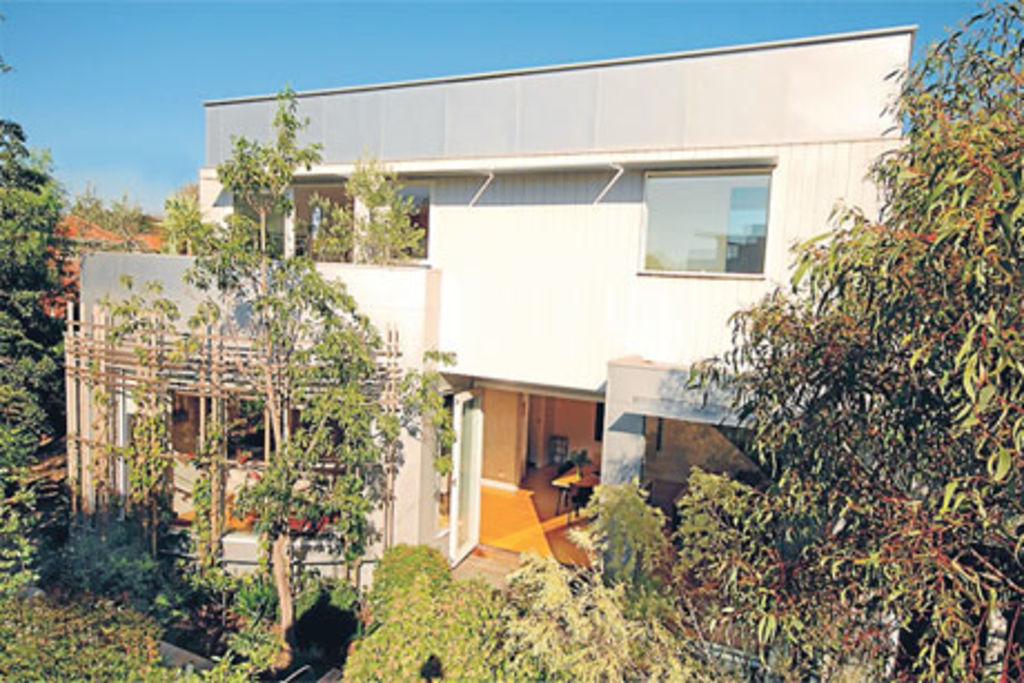
‘I like it light,” architect Marcus O’Reilly says. In extending his Edwardian Elwood weatherboard that also serves as the practice office, he has certainly demonstrated that preference. On an overcast day, the place shimmers with natural light.
On north and east walls of the two-level addition at the back, windows have been inserted wherever possible. And if that’s not enough, skylights are in the kitchen, laundry and over the stairwell. The kitchen skylight is five metres long.
Of course, this predilection needs high summer management. “You have to be active and hoick the blinds down,” he says. In summer, the beautiful arc of windows that define the curve of the living room are covered with green-filtering, climbing kiwi fruit and bougainvillea, exploring their way up the fine ribs of the framing pergola he made in the back shed. As shading, “it works a treat”.
O’Reilly also fabricated a simple system of eaves that sits above the northern-facade windows. Simple, square trays of galvanised plate act as “eyebrow eaves that sit right above the windows. Very effective,” he says. “You just bolt them on.”
In peak summer, these eaves block out overhead sun, while the narrow gaps between allow light slivers “to create stringlines of sun rays that move across the facade throughout the whole day”.
Being an architect working on his own home, and having bought a block a shade over the scale requiring too many planning permits, O’Reilly was able to move in with the building gang the day after he and partner Nicky, and their twin teenage sons, took settlement.
The long block, with the century-old front-yard palm tree and the back lane, is 502 square metres.
Behind the front four rooms and hallway of the old house, he razed the hodgepodge of service rooms at the back and set the slightly raised range of the new downstairs living spaces and upstairs main suite back against the southern boundary.
“Running the long finger of the building to expose the broadside to northern light and wrapping the garden around it makes you feel like you’ve got more garden than there really is.”
The option to curve the living-room window was the key to effecting an illusion of garden scale. A modern take on the bay window, complete with a curving window seat, this “softening curve makes a relatively narrow north garden feel wider”. O’Reilly terms it “localised extra width”.
“I could have squared it off. But the curving plane gives the lounge room diagonal views that make things feel bigger.” By cutting the corner “we got different aspects in the garden”.
Internally, the volume changes “modulate” the living-kitchen-dining area into implied use zones. “It’s one big space but it’s not a basketball court,” he says.
The 121-square-metre extension was a big build but the architect was able to cut some cost corners to the immediate building and the future running expenses by making it as solar-passive as possible. “Insulation costs very little.”
He clad the exterior facades in dull silver plates of Zincalume.
“Zincalume over studs and second-grade plasterboard are about the cheapest materials that you can use,” O’Reilly says.
Thermal mass is contained in the solid downstairs walls that collect heat from deeply penetrating winter sun. They were built from brick recycled from the demolition of two chimneys.
These thick walls have been rendered as roughly as possible.
“I told the renderer to pretend it was his first day on the job because I like the way (the texture) catches the light. It’s an earthy material and a nice counterpoint to the other elements that are slick.”
The elements of tactile contact — the rock maple-veneered kitchen cupboards, the honey-wood alpine ash floors and the reconstituted stone benches in the kitchen and bathroom — are slick and earthy at the same time.
The stairway up to the main suite under the skillion roof is earthy and slick, too. It’s just the black bones of 16 risers and an open steel balustrade.
“Nice raw steel — stripped back and dramatic,” O’Reilly says.
The parents opted for the upstairs suite, “up there in the good sun and the nice, long views”. And instead of a walk-in wardrobe, they gave themselves a seven metre-long piece of feature joinery in myrtle veneer. Set right along the wall, it contains wardrobes, other storage and a recessed bed alcove.
O’Reilly says a walk-in wardrobe would have consumed too much of the 3.6 metre-wide room. “Instead, we just ran it all along the wall. It’s simple enough.”
Simple, too, is the curved balcony that mimics the arcing window downstairs in the lounge.
The show of this architect’s own home is not in any overt or self-conscious design flourishes but in the enveloping sense of light and spatial simplicity. “It’s all about the play of light,” he admits.
We thought you might like
States
Capital Cities
Capital Cities - Rentals
Popular Areas
Allhomes
More


