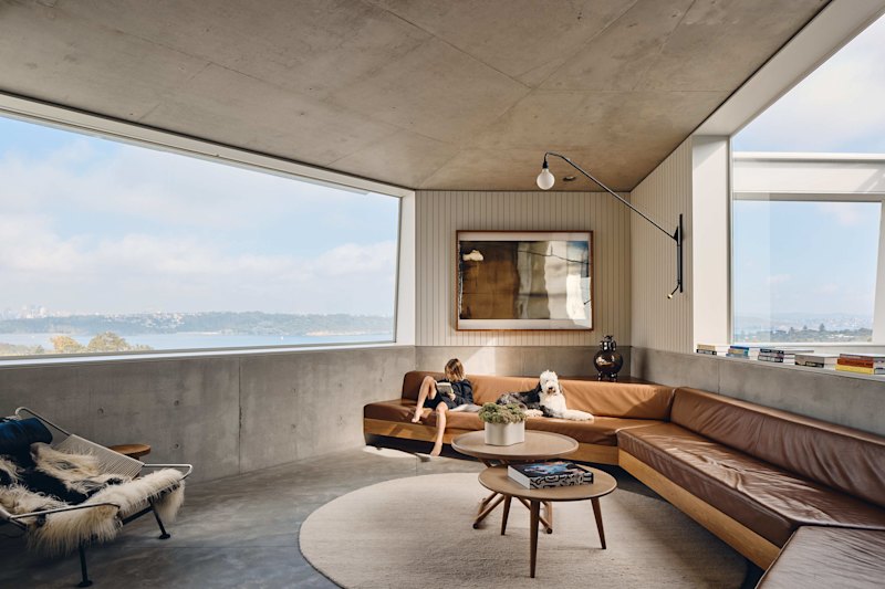
'Like a luxury hotel': Converted Melbourne warehouse apartment an oasis in the bustling CBD
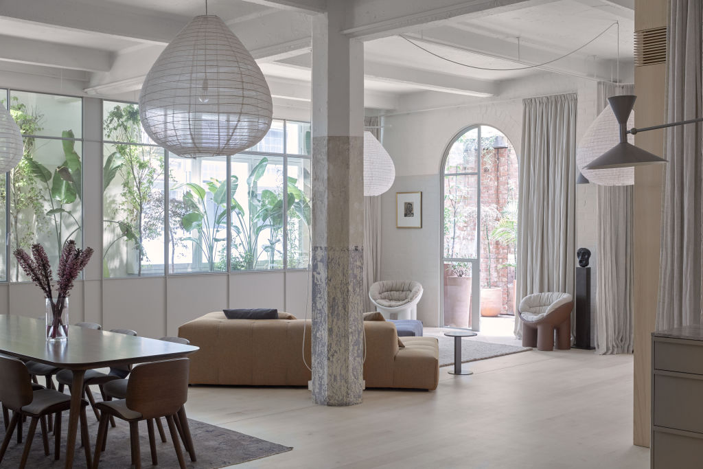
The first thing that hits you is the pin-drop quiet. Or, at least, the sudden absence of noise, as you breeze into the whole-floor apartment (550 square metres) off the bustling CBD laneway and close the door on the outside city din.
Then you’re inevitably struck by the clean, modern beauty of the architect-crafted interiors.
Blissful, but somewhat expected. Located in the heart of one of Melbourne’s most lively dining quarters, the 1907 building – known as The Bond Store – is made primarily from concrete.
Built by engineer and military commander Sir John Monash for retailer Mitchells to store goods, the now-heritage-listed building was Australia’s first reinforced off-form concrete structure.
“It was made strong enough to insure goods cheaply,” says property developer Danny Schwartz, who, with his fashion-and-interior designer wife Uschi, completely overhauled the apartment.
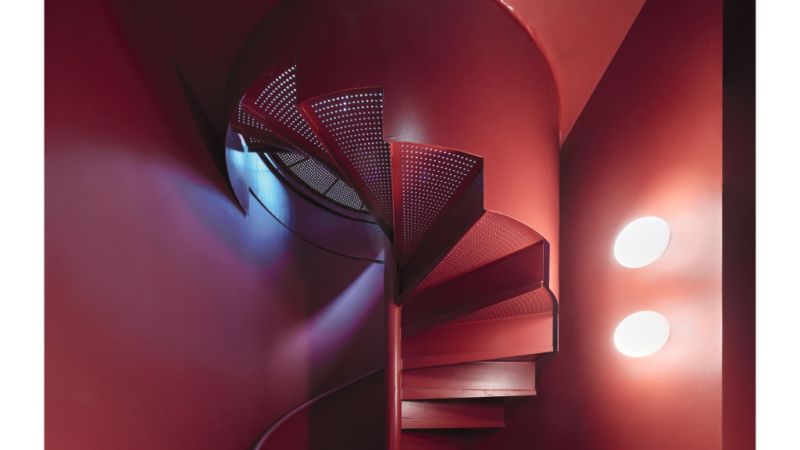
With rubbish trucks on 4am runs adding to the cacophony, the couple had the apartment triple-glazed as part of the rebuild, completed in 2019. They sold it to the current owner in 2020.
“One of the glass layers is 20 millimetres thick,” says Schwartz, who employed an acoustic engineer for the job. “We also soundproofed the subfloor. It’s like a recording studio.”
More than just silence, a green oasis of living plants between the layers of glass lends an air of tranquillity.
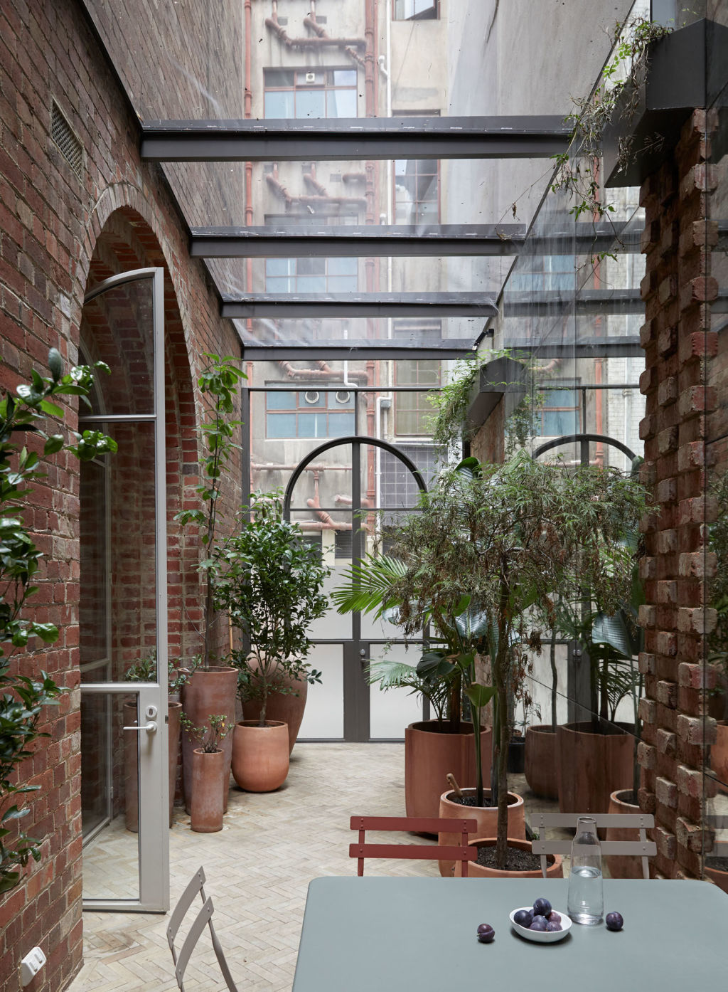
The Schwartzes bought the two ground-floor apartments – which were like “rabbit warrens” – in 2017-18 to combine into a single grand residence.
They gutted the entire floor of everything including false ceilings, plaster walls and floors, filling about 30 large bins and stripping the interior to its concrete bones.
“We wanted to open it up and give it the sense of warehouse space it once enjoyed in a city where apartments are often cramped,” says Schwartz, who owns and has renovated other units in the building.
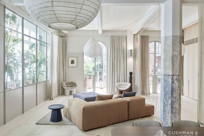
Uschi worked in the building in the 1990s, when it was used for clothing manufacturing and textile storage.
The couple produced an initial design for architects O’Connor and Houle to work with.
“We wanted the interior as transparent as possible from front to back,” explains principal Stephen O’Connor, whose great-great-uncle – in a lovely twist – worked with Monash.
Entering through a steel-and-glass vestibule, it’s amazing how much you immediately see. Under 3.4-metre ceilings are a lounge, play area (with swing) and study nook; beyond, behind steel-framed glass walls, the main bedroom and dressing room, made private with curtains.
To the right are two multipurpose rooms currently used as a study and office.
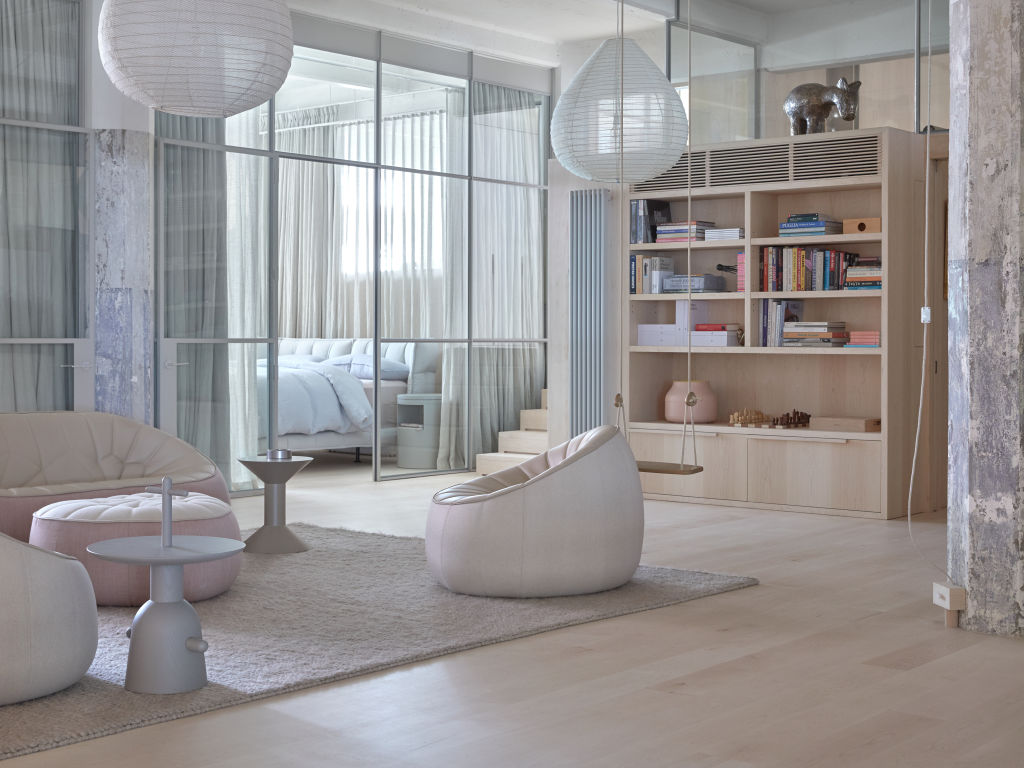
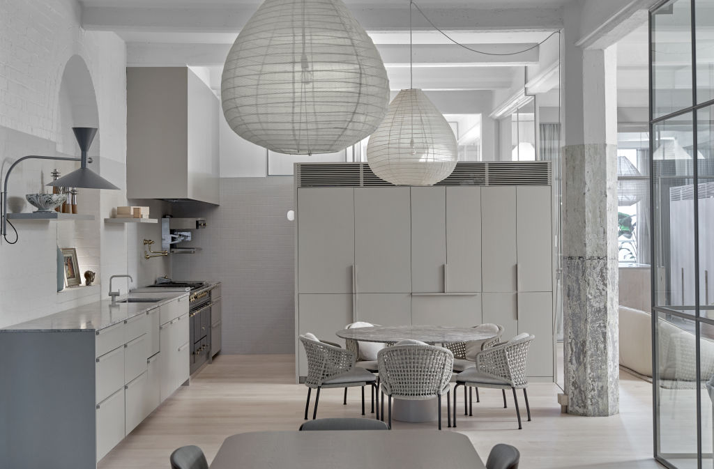
Panning left, you see the kitchen, dining and living areas and space for yoga or cardio training. These flow through stepped brick archways to an adjoining courtyard with its own street entrance.
Formerly stables, the courtyard was bought midway through construction and added to the project. Notably, the wall is five bricks thick, offering further soundproofing.
“It’s like your own home in the middle of town,” Schwartz says.
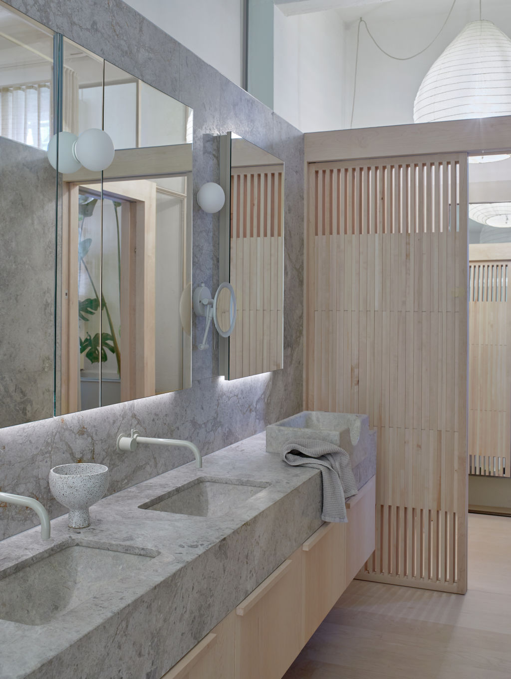
Glass-topped partitions – like highlight windows – enhance the openness while diffusing natural light – which, in laneway buildings, is limited.
Cleverly concealed tunable lighting helps, too. “You can tune the colour temperature to simulate early morning, evening or the middle of the day for ambience,” O’Connor says. “It’s a significant part of the design.”
There are also out-of-way places: a bedroom with a reading nook, a media room and a laundry.
Tucked up at the front of the apartment is lockable, self-contained accommodation – or an office – with a kitchenette. It also has its own entrance, accessed from the O’Connor and Houle-designed lobby, portico and front garden.
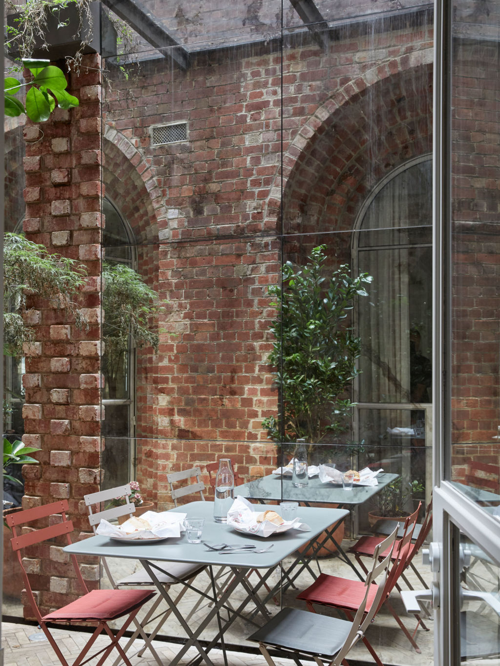
Care was taken to retain a sense of the building’s industrial past. It’s present in the painted dado line, exposed brickwork and concrete ceiling, beams and octagonal columns, still with their original paint.
“We wanted concrete to be the hero,” Schwartz says.
But it’s overlaid with a wonderfully pale, soft cosmopolitan skin: oak-lined walls and joinery, maple floors imported from Canada, Italian limestone benches, Turkish travertine, Japanese INAX tiles and Paris Au Mois D’Août fabric pendants.
“It’s like a luxury hotel,” says Cushman and Wakefield agent Anthony Kirwan.
“It’s the perfect primary residence for a downsizer or as a weekender. I can also see it working as a retail space for a luxury brand. It’s a pretty special property.”
We recommend
We thought you might like
States
Capital Cities
Capital Cities - Rentals
Popular Areas
Allhomes
More
