Making do with a simple abundance
Sustainability and green design are terms oft bandied about these days but both are intrinsic to the work of Phooey Architects.
Creating zero waste is one of the key principles by which it operates: reuse and recycling are front and centre in all its designs.
In this Ashburton house, that is abundantly clear in many ways, some overt, some subtle.
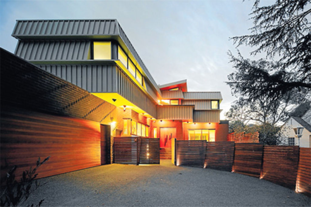
Offcuts from the fan-like front fence are reconfigured inside cleverly to create light wells, abstract features on ceilings and door handles. Outside, the colour of the steel used in the side wall is the main colour interspersed with white.
Carpet upstairs is a chequered mix of dark and light, courtesy of recycled carpet squares, whereby different job lots are combined to form one.
Business and life partners Peter Ho and Emma Young are Phooey Architects and, as their name intimates, playfulness is a big part of what they do. The carpet squares are one example of their philosophies melding; a lack of constraint tends to characterise much of what they do. There is an openness to their approach, too, which means it is difficult to define their aesthetic. Ho says they don’t want to be locked into a particular style.
“Sustainable architecture doesn’t have a certain look,” he says. “While we might have a key idea, we will present a range of master visions to allow the client to determine [the outcome] … often in the master plans there are seeds of ideas that we take forward.
“Emma and I like to think it’s a learning process — we like to be a bit more fluid and dynamic and understand the client’s expectations.”
Finished in July last year, the Ashburton house was an owner-builder project; Ho went to school with the client, whose father-in-law was the builder. While the clients left the aesthetics largely to Phooey, they wanted an energy-efficient house with open living spaces.
“Making good architecture and good buildings requires good teamwork,” Ho says. “[We were] lucky to have a good client who was happy to entertain us in the process.”
Early on, the plan was to extend but the 1950s weatherboard on the site ended up razed. “We think we’re saving money when we renovate but the operational costs that are affected [can negate] those build costs,” Ho says. “It makes sense to get those [operational costs] right at the outset.”
In its place is a dramatic, somewhat surprising house for the suburbs. The three-tiered, saw-toothed facade is self-shading, creating its own eaves and providing relief from the summer sun. In stark contrast to the solid mass of dark brick of the ground floor, the light-coloured steel introduces an industrial element to the aesthetic.
Gardiners Creek Trail runs alongside the site, creating a stunning backdrop. The one property between the park and the site is also home to a number of “humungous trees” and that view decreed pretty much everything about the design, dominating from all rooms at the front of the house. Ironically, the neighbouring trees, while part of the lovely outlook, created issues in terms of access to light in the house. Clever devices, such as ceilings that step up to create a window, are introduced upstairs in the bathroom, en suite and walk-in wardrobe to allow the light through.
“One of the challenges of a suburban site is what you can take advantage of outside,” Ho says.
There was a gentle rise to the original topography of the site, which has been followed by the design. At the front of the block, a series of steps lead up to the front door. Elevating the house ensured unobstructed views out to the park, with the front fence ensuring privacy. Covered in stone, the circular top of the underground water tank becomes part of a deck in the front yard, which is designed as a usable outdoor space.
Inside, the entrance is dominated by an impressive staircase, lined by slats of bronze and gold steel that work as a balustrade as well as a design feature. Behind is a large, open-plan living space that incorporates the kitchen at one end, meals area in the middle and the living room at the other; spotted-gum floorboards run throughout the downstairs.
Swathes of glass across the back wall incorporate windows and sliding doors, which open to a terrace and the stepped backyard.
Upstairs, the main bedroom at the front looks directly over the park (as does the study downstairs), while two smaller bedrooms at the back take in the borrowed view of the park and the backyard. A stunning orange-and-white tiled bathroom ties in nicely with the orange in the ceiling above the staircase.
Colours such as the orange inside reflect an autumnal palette. It appears in some panels of the louvres at the bottom of the stairs and a rich green is used in the kitchen splashbacks, complementing natural materials such as the timber of the stairs and the cabinetry in the living room.
Referencing nature fits with the Phooey philosophy. “It’s easy to pass [responsibility] on to someone else in the future [but] we deal with things as we get them,” Ho says.
“To use things in the most effective way possible, that’s the commitment we make.”
Upcycling, an exhibition of Phooey’s work, will be at the Wunderlich Gallery, University of Melbourne, until October 1.
Ashburton house
Design Phooey Architects,
phooey.com.au
Builder Petru Gheorghiu,
States
Capital Cities
Capital Cities - Rentals
Popular Areas
Allhomes
More
