In Melbourne and Brisbane, two mid-level developments show how density can work well
The 20-year process of increasing density in detached house neighbourhoods has so far delivered a mixed bag of results and reviews.
Some multiple unit blocks and townhouses have been good and have held appeal and resale value. A lot have been bad and quickly slipped to low rent status. Far too many have been dog-box ugly, standing now as visual detractions in precincts they could have improved.
But as two recent projects demonstrate, some newer mid-scale developments are striving to add to their locales by referencing and respecting their contexts and connections.
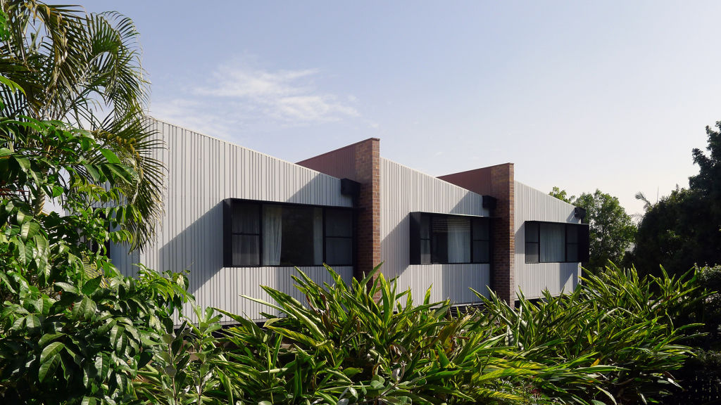
Though 1600-plus kilometres apart, the Chaucer Townhouse pair in Melbourne’s St Kilda and the Longfellow Terraces in Brisbane’s Norman Park are idiomatically linked by more than poetic place names.
Both offer three-bedroom accommodations that make them viable for families and, because they’re in near-city situations, hold as much appeal for downsizers and working professionals.
Norman Park, south of the Brisbane River, is only four kilometres from central Brisbane. Bayside St Kilda is one of Melbourne’s most famous inner-ring suburbs and is six kilometres from the CBD.
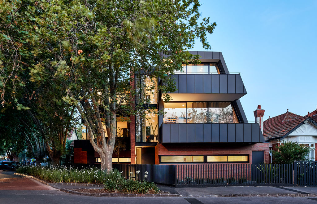
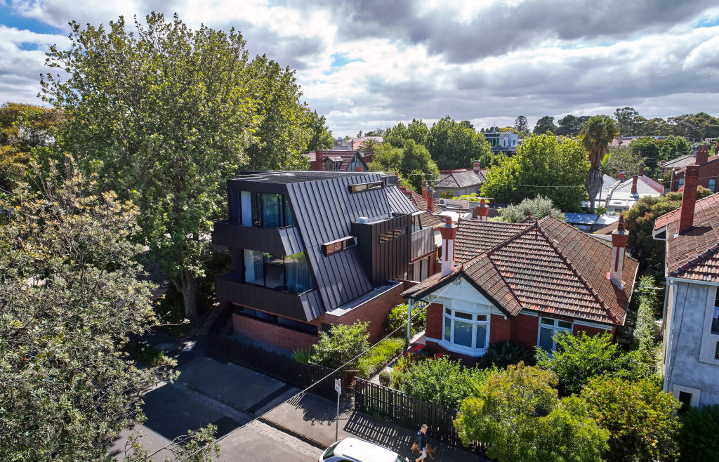
Set on an odd-shaped corner block opposite the strangely named Peanut Farm parklands, and equidistant from the beach and Acland Street cafes, the Chaucer Townhouses are by long-time St Kilda specialist Grant Amon Architects.
With a red-brick materiality on the podium level, and a short steel picket fence, the building links strongly not only to the Federation houses around it “but also to the pedestrian or street level,” says Grant Amon.
“It creates a level of exchange between the users and the public realm and it’s an important nuance because it means a building on a prominent site can have a presence yet not be abrupt.”
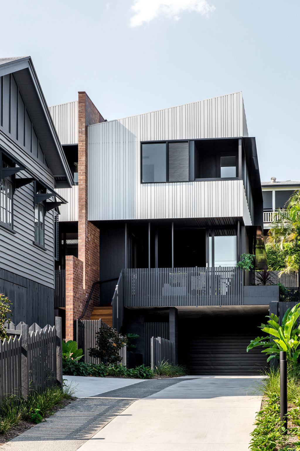
The three Longfellow Terraces by Refresh Design, a practice pioneering what architect Erhard Rathmayr sees as “the missing mid-scale” in a capital “still in transition from being a big country town to a city”, represents the third small residential block he and a developer partner have undertaken by utilising the big backyards of old Queenslanders.
By moving the wooden house slightly aside and forward on an 800-square-metre block, space was made for three sharp, contemporary townhouses that share a basement car park. All have generous 5.2-metre wide frontages divided by brick party and entry stair blade walls.
Here again, the brick elements are important because being “black and tans, they’re a local brick that has the colours of this part of Queensland”, says Rathmayr. “They were heavily used in the 1970s and a ’70s unit block next door is made of them, so we were able to marry our development in.”
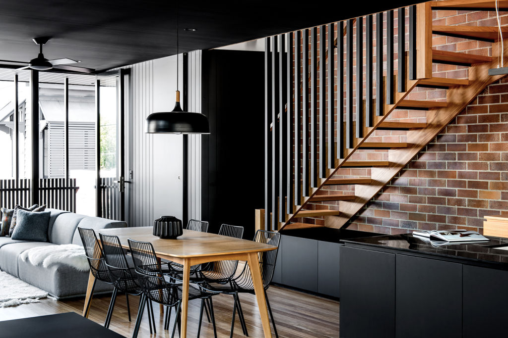
In a town still grappling with the very idea of multi-res in its residential neighbourhoods “because a lot of mediocre stuff got built here in the past”, and where the terrace type is rare because an early governor didn’t like them, the Longfellow group has elicited a mixed reception, Rathmayr admits.
“Brisbane people are very protective of their backyards.”
Yet the sales, almost exclusively to owner-occupiers in all the townhouse groups, tell a different story.
The architect says inquiries are already coming about the next similar development which is on the drawing board.
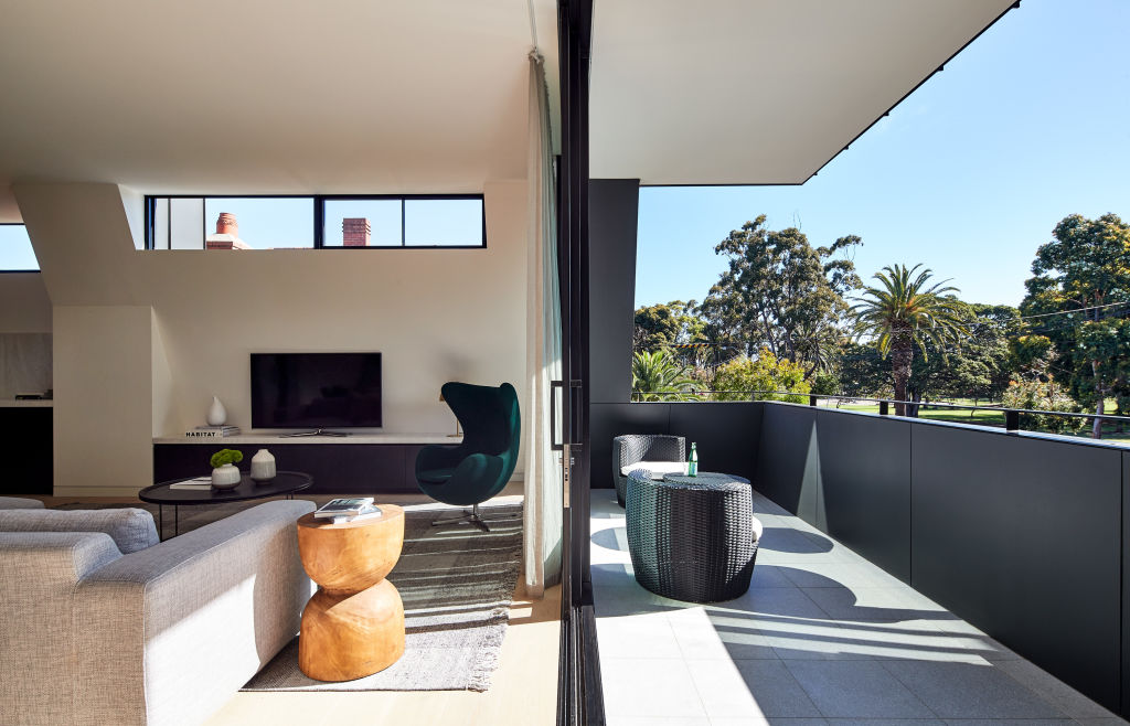
Snuggling up to some majestic plane trees that shelter the north-western glazed aspects of the building from summer sun, the Chaucer Townhouses are on three levels above the shared basement car park.
They were created for a builder developer who found it hard to choose which of the two units he wanted, and which he would sell.
He chose the rear one that has so much exposure into the tree canopy that Amon says “it feels like a treehouse”.
With the angular, in-sloping roof respecting the neighbour’s rights to sunlight; with the scale and height similar to nearby interwar flats; with a single access point to the garage that makes it look like the one-car brick garage it replaced, Amon has been pleased to have been asked what this new building in the “exotic, eclectic Victoriana- to-’60s neighbourhood of St Kilda” is, exactly.
“People have asked if it’s a single house or a block of flats. But most have said, ‘Good job. We like it.’ And we see that as the big plus.”
We thought you might like
States
Capital Cities
Capital Cities - Rentals
Popular Areas
Allhomes
More
