Nexus Designs revamp the interiors of a weatherboard weekender in Long Island
“Hamptons style” is the modish descriptor of an American type of coastal, casual, understated design. But rather than using it just as a simile, Melbourne’s Nexus Designs reappointed the interiors of a three-bedroom weatherboard weekender on the South Fork of Long Island in New York State for some long-term and obviously incredibly loyal clients.
Nexus creative director Sonia Simpfendorfer says the Canadian-Australian couple for whom the practice had previously done the interiors of a Melbourne house and a Manhattan loft, and who claim their two pavilion house to be “the un-Hamptons” or in the un-snobby part of the island – had specifically asked for the all-seasons holiday home to exemplify what is Nexus’ signature style: “Simple, open, purposeful, not too over-stuffed and not too overmatched,” Simpfendorfer says.
They didn’t want either version of the accepted Hamptons style; “either beautiful but safe, or over-the-top and grandiose”. “This was their escape. They wanted it to feel good and liveable. That was incredibly important to them because they have a lot of visitors.”
One of the Nexus team made a couple of trips to the house. But given such a well-established and trusting rapport, the rest of the project was completed via email and Skype consultations.
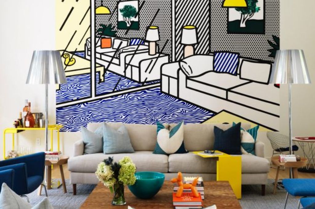
The clients found most of “the high-low furniture during the process”, Simpfendorfer says. “They included vintage and generic pieces and design classics. And along the way they found the Lichtenstein ‘wallpaper’ which they bought in as an art piece.
“We said ‘wow!’ we can work with that.”
Following the Nexus tenet “that it is better to have one standout piece rather than lots of little things”, the designers worked the giant graphic of a lounge room into the real living area, picking up on the blues and yellow in the 3D furnishings.
If you look at the silvery lamps and the key pops of yellow that appear both in the real and the art work scheme, there’s a nice bit of wit in play.
“Because the seating group merges into the painting, you’re not sure whether the lamps are in the room or in the image?”
Uncharacteristic of US-derived Hamptons style, is the featuring of the many different and sometimes strong shades of blue in the living, dining and bedroom areas, “from sky blue to deep slate blue, to a blue/green in the dining chairs”.
“We deliberately avoided (truer) greens because there is just so much greenery in the landscape – loads of green. We didn’t want to compete with that.
“So instead we used blues and yellows as links to the Lichtenstein and to the colours of the (nearby) ocean and sunshine.”
Both are referential of place, Simpfendorfer says. “But are not stereotypical beachy schemes.”
The opportunity to do such a comprehensive makeover of a house in another country was not an exercise in aping the local mode, neither was it about exporting a cliche Australian coastal look.
“We didn’t want to do odd or jarring in the location, and there is nothing that is not appropriate to the clients or to the place.
“But we were happy to find that our Australian aesthetic was so very transferable and workable and that the project came out as what we think is such a happy, delightful and very liveable house.”
We thought you might like
States
Capital Cities
Capital Cities - Rentals
Popular Areas
Allhomes
More
