Oliphant-original Salo House opens its doors this Sunday for an exclusive tour

You know that a house has a story when it has its own Instagram account (@salohouse). Salo House is a fine example.
Bought by Steven and Lisa Cetrtek in 2016, the husband-and-wife team restored and extended this single-story Griffith residence to maintain its significance as a relic of Canberra’s suburban architecture, while creating a practical family home.
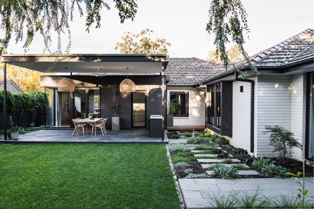
Its significance lies in being an original design of Kenneth Oliphant – an architect prolific in the 1920s to 1950s, who is credited for his contribution to defining the Canberra streetscape through many residential designs, primarily in the inner-south, including heritage Calthorpe’s House. Salo House was designed in the latter part of Oliphant’s career in the 1950s.
As an architect himself and owner of local firm Thursday Architecture, Steven immediately recognised the distinctive Oliphant design and could not pass on the opportunity to restore the significant piece of Canberra’s history while contributing with his own flair.
“The home isn’t heritage-listed, but we felt strongly about retaining it,” says Steven. “We wanted to retain the original front façade of the home because it had classic ’50s proportions. This became the starting point for the brief.”
There were several outdated aspects to the design of the house, including awkwardly placed bathrooms and compartmentalised living spaces.
There were, however, certain qualities that Steven and Lisa loved, such as the high ceilings and wide hallways that create a sense of space and light, as well as the distinctive corner windows that wrap around the front of the house.
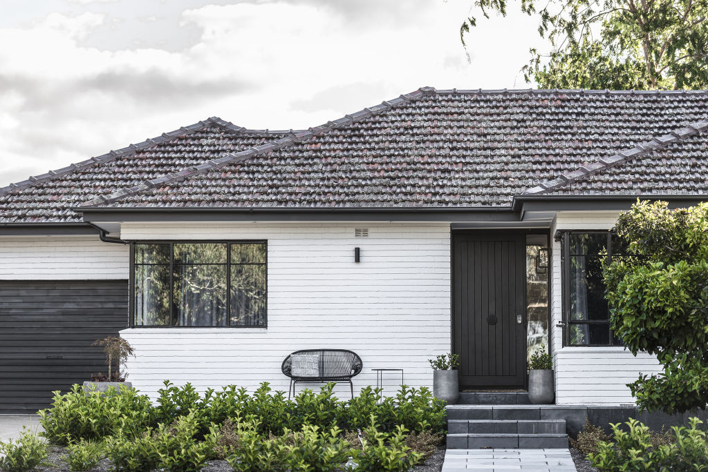
“There were details of the existing home that we wanted to keep, particularly the feel of the windows,” says Steven.
“The new windows were designed to complement the original ones – big proportions and nooks that allow people to sit inside the frames.”
Steven says the challenge was redefining the space to suit current family living, emphasising practicality and usability.
The final design is sympathetic to its original street character. The entry and adjacent rooms remained, with one room becoming a living space now affectionately known as the “green room” for its deep emerald hues, with a fireplace and styled for maximum cosiness.
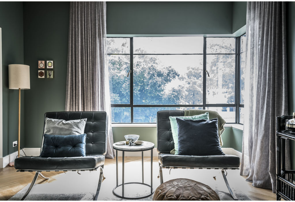
Beyond the original layout at the front, the rest of the design was extended and modernised to fit within the couple’s lifestyle. This involved demolishing the brick walls that enclosed the kitchen, dining and living spaces.
“I wanted to knock everything down to connect these spaces and create a light-filled layout,” Steven says.
The result is an open-plan living area that overlooks and connects to the north-facing, private backyard.
The home’s vintage charm is carried throughout the house by oak herringbone flooring, a pattern that is also mimicked in the bathroom’s marble tiling.
“We went for classic finishes. We wanted the new to match the old so it looked and felt as a whole. We also sourced terracotta tiles with moss on them so the roof blended in seamlessly.”
Lisa’s eye for interior design has resulted in refreshing tones of grey and white, and light-washed wood, which creates bright spaces.
It is the perfect base for splashes of colour like the green indoor plants and velvet blue cushions. The soft mid-century modern approach to decoration expresses itself in functional furniture with sleek forms, minimal ornamentation and the juxtaposition of wood and fabric textures.
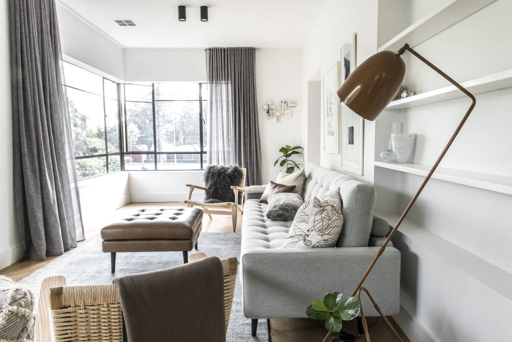
The home’s energy efficiency was also enhanced. Insulation was added to the structure, double-glazed windows were installed, while the original steel-framed corner windows were reglazed.
Outside, landscape designer Dinah Meagher has designed a garden that integrates with the house, with the construction of a terrace that flows directly from the open-plan living space, as well as a deck to surround a large elm tree.
“The family loves the backyard, and we are constantly out there, playing, eating, chilling,” says Steven.
- During the 2018 Design Canberra Festival, Salo House will be open to the public as part of the Living Rooms: Inner South series on November 11 from 12.30pm-2pm at 80 Captain Cook Crescent, Griffith.
We recommend
States
Capital Cities
Capital Cities - Rentals
Popular Areas
Allhomes
More
