Open and shuttered case in coastal design
To architect Andrew Mellios, Victoria’s first and failed 1803 settlement site in a sheltered cove near Sorrento is important.
So much so, that when designing a new multi-generational, multiple-pavilion, five-bedroom house on a rare single lot subdivision right on the beach, he wanted to touch the ground lightly.
That there were also stories of long Aboriginal occupation added to the onus that deference to the place was necessary. “We needed to create something that felt sensitive to its location but also felt like a home,” he says.
That Mellios can make the “softly touched” claim for a rangy, C-shaped structure with a double-storey wing facing the road, an internal shell formed of pre-insulated concrete and a thick concrete flooring slab, is interesting.
Yet, if you look at the slab that contains local granite as aggregate, it is “floating” slightly above the ground surface. And all the interior concrete furniture made in situ; the fireplace plinth and the kitchen island bench also appear to hover.
As with the front profile of the main, beach-fronting and almost wholly glazed and transparent living/kitchen pavilion with the behind-the-scenes scullery, there is a repeated and subtle asymmetry to the sea-facing wing.
The shape of the frontage is slightly cranked “because that’s the form of the coastline there”, Mellios says. “We’ve referenced the angles in the building.”
The remarkable statement show of the faceted blackbutt timbered ceiling is again affected by the topography. “The lines in it actually draw your eye out to the different parts of the view,” Mellios says.
The extreme see-through quality of the front zone is not only because, well, why would you not? But it also allows the second living room in the building across the courtyard to look right through to the water.
In three-generational lifestyles, zoning is of paramount importance. “The second living room is for the children but it can still see the beach,” he says.
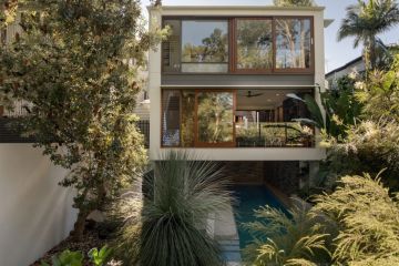
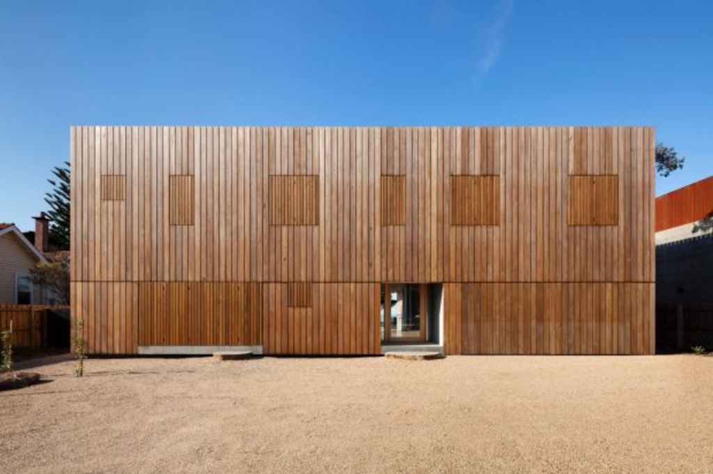
The coastside feel of being so open is in contrast to the “austere street presentation” of the multiple-shuttered, double-storey wing that contains the sleeping quarters.
Again constructed with the concrete panels, its exteriors have been over-timbered with 32-centimetre profile blackbutt boards in which shutters of a different timber width open and close with an advent calendar effect.
Delivering filtered daylight when closed, the shutters have another purpose because in designing a house in such a special place, the building envelope was so tight Mellios maxed out to its boundaries which left no room for eaves. The shutters do that job.
The total commitment to the timbering effect is another visual reference to the local piers and coast infrastructure, Mellios says.
“And steers the house away from being domestically polite,” he says.
“We thought it should have a (street-side) austerity but it becomes more open and relaxed the closer it gets to the beach.”
The continual counter-play of openness and closure is also evident in the blackbutt-veneered “snug” area that is the library, which Mellios describes as a “night-time space”.
With a dropped timber ceiling, desk, shelves, couch and fireplace, it is a place to retreat to.
So, too, is the upstairs deck and the master bedroom suite, with the bath that takes advantage of the opportunity to see but not be seen.
One of AM Architecture’s largest projects to date, in terms of detailing, Mellios says it was “intense”.
But that’s what it took to create a family shelter that is both about deference and sandy-footed ease.
We recommend
We thought you might like
States
Capital Cities
Capital Cities - Rentals
Popular Areas
Allhomes
More

