Tall renovation of Clovelly house uses big volumes to add feeling of space
Brisbane architect Brad Muller often works out of town. He lists Darwin, Cairns, Charleville and Roma. When his practise DM2 Architecture got a job to extend a Clovelly terrace, it was no issue because “it’s easier for us to get to Sydney than Heron Island”. Plus, “being a Queenslander you don’t get to do terrace houses so I jumped at it”.
The remotely administered project relied on a good relationship with “very organised builders”, in this instance Jarrod and Sam of Build by Design; “a lot of homework in backgrounding ourselves about different legislative requirements, many flying visits and multiple weekly phone hook ups”.
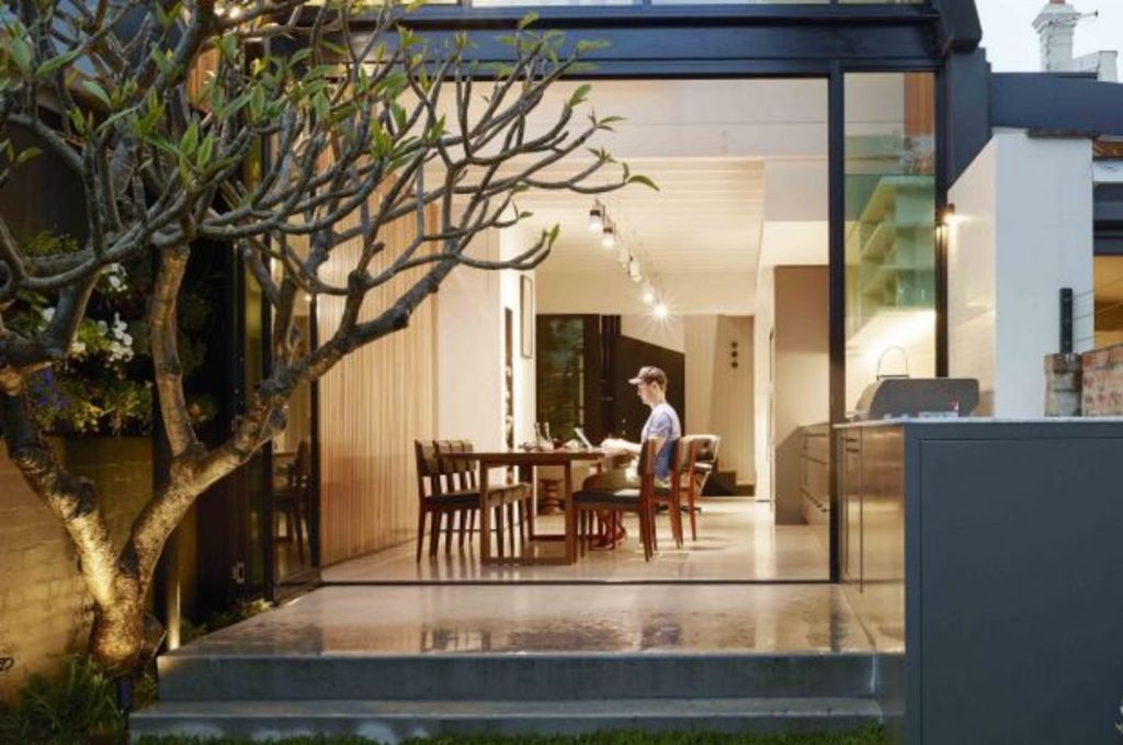
Before divulging the scale of the quite marvellously textured building – “I love texture because it brings the soul” – have a look at the photos and decide whether this is a large, moderate or small home?
It has three, potentially four, bedrooms if the front library is used as a sleeping chamber. It has an open living/dining/kitchen, a centrally-situated timber stair that winds up eastern glass walls and brushes an internalised section of the slate roof that the architect “dares anyone not to run their hands across”.
That tall rear box that slants to one side provides a top-up of head space over the end of the kitchen/dining area, as well as deep winter sun penetration. And the vertical applications of the timber and rising glass walls – both of which seem lofty enough to carry cranked seams – mean the new additions read as really tall.
How tall? “Not so high”, Muller admits. “It’s just that it is so narrow and that the Blackbutt timbering draws your eye up that the volumes look generous and not mean”.

In most suburban languages, a house 4.5 metres wide is tiny, even for a 19th Century terrace. So why not keep the new work as simple as white plasterboard and squared up rooms?
For starters, that’s not Muller’s style. Rather, so much about this place is entertaining. The unexpected outlook to the roof; the multiple angular walls, even the timber cladding that is applied in places on a slope.
Regard too, the modern take on a bow window in the upstairs master bedroom that projects over the living areas and adds a reading place and viewing perch peering through the glass back walls to distant Bondi.

Muller was never going to do plain, as he believes the apparently big volumes in a small house make it feel open and that all that texture is what imparts “character and homeliness”.
The other insinuation of scale, he reckons, is “that there’s always a vista through to another area and to the outside. You feel cosseted but can always see what the weather is doing”.


We recommend
We thought you might like
States
Capital Cities
Capital Cities - Rentals
Popular Areas
Allhomes
More
