The Block 2018: Domain judge Alice Stolz’s inside word on week four, master suite week
Once upon a time a bedroom was just a bedroom, but nowadays, no home is complete without a master suite.
Kerrie and Spence are starting to see if the twist they made to their architect’s plans will pay off (remember they made the bathroom a wee bit smaller and the walk-in-robe bigger).
I admit I do like the footprint size and think it complements their en suite beautifully. Correct proportions are so important when it comes to how a property feels. I am really impressed by the space of their WIR and the extra cupboards across the wall. It all feels clever and ample.
My fingers are crossed Kerrie and Spence knock it out of the park with their styling. We need a bit of St Kilda edginess to start creeping in, especially to modernise the heritage feel of their property.
Courtney and Hans have what must be the truest example of a master suite I’ve ever seen. The size of it needs to been seen to be believed; they’re clearly feeling it’s the best and worst aspect about their apartment. Oversized spaces when executed well scream luxury, but gosh, for rookie renovators – you wouldn’t blame them if they curled up on the floor in a ball right about now.
The way to tackle this is to take a nod from luxury hotels that manage to house a bed, side tables, lamps, desk, sofa, television and all the other luxe additions and somehow make a room feel cosy. But wow, that walk in robe, another hallway – this room may make or break Courtney and Hans.
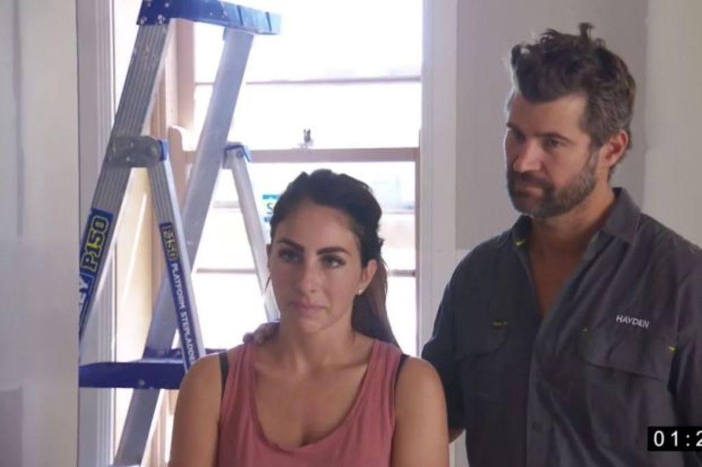
Sara and Hayden‘s space has a cosy feel similar to Kerrie and Spence’s and I’m encouraged that Sara is talking about sophistication and restraint this week. I’m slightly disappointed by the size of their walk in robe, it just doesn’t feel generous enough at this end of the market.
- Related: The five best main bathrooms ever produced on The Block
- Related: Ten rules you probably didn’t know existed on The Block
- Related: Must-have features of a luxury bathroom renovation
Carla and Bianca seem to be channelling a lot of dark colours this week and I’m not convinced the wall behind the master bed needs to be as detailed as what they’ve done to it. I’m also concerned that they having fiddled with architect’s plans, the door to the loo is now not in the right spot. But all is forgiven with those lovely cupboards and the flourish of brass. And the wallpaper TV — the most genius solution to those who don’t like the look of a TV in the bedroom — there’s an answer to this conundrum once and for all.
I went into Jess and Norm‘s not overly confident they’d deliver this week, but they did. The room is far from huge, but the position it’s in and the way it functions is actually really clever.
I’m worried how looming a television will seem in the space they’ve allocated for it (reminder, this is a master suite, not a media room!) but I love the natty and functional walk-in robe and I’m very happy to see the marble they used in the en suite is appearing again. This challenge turned out to be a case of size doesn’t matter and for that, Jess and Norm get the gong for the Domain prize this week.
The scores:
Norm and Jess: 9
Bianca and Carla: 8.5
Kerrie and Spence: 8.5
Courtney and Hans: 8
Hayden and Sara: 8
We recommend
States
Capital Cities
Capital Cities - Rentals
Popular Areas
Allhomes
More


