The Block 2023 en suite reveals: Feuding teams tie with 'near perfect' bathrooms
Continuing our recaps from our expert panel of ex-Block contestants, who will this year get to spend room-reveal night judging from their couch rather than standing on the proverbial chopping block before Scotty Cam. This week, Season 8 contestants Kyal and Kara Demmrich dissect the fourth room reveal of Season 19, 2023.
Bathrooms and kitchens are our favourite spaces to design, and we believe that an en suite is the perfect room to win the hearts of a potential buyer.
It’s the icing on the cake of the master en suites and therefore a great opportunity to ensure a cohesive theme is carried throughout the bedroom, walk-in-wardrobe and en suite.
When we approach the design of an en suite, our main functionality points to hit include a practical shower space, plenty of storage and an adequate amount of bench space on either side of a basin. With this in mind, let’s see how the teams fared this week.
House 1: Kyle and Leslie (spend $25,969)
Kyle and Leslie delivered another curved feature this week in the form of symmetrical arched shower screens that double as vanity walls.
Although the judges initially loved the aesthetic, they found issues with the functionality, and we must agree with them in this instance.
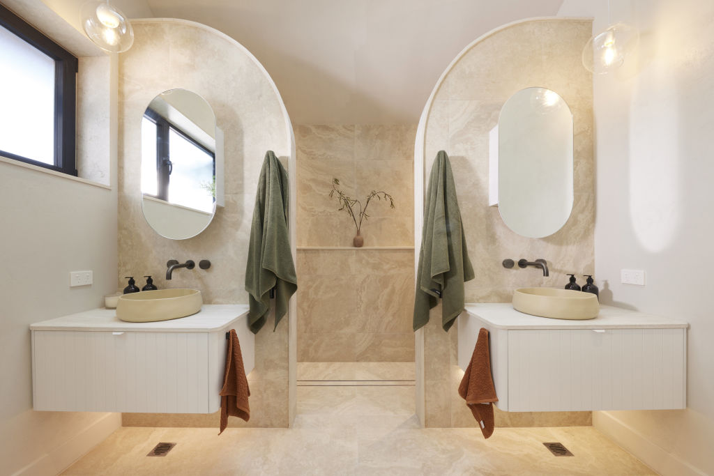
Although this space will photograph beautifully, the shower dimensions seem tight, the grate drain placement isn’t ideal and there is minimal bench space considering the overall room dimensions they had available to work with.
House 2: Leah & Ash (spend $26,014)
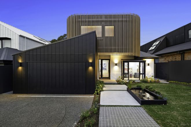
This week Leah and Ash delivered an en suite complete with a shower worthy of its own postcode. There’s a lot to love about this en suite, in our opinion.
We love the grandeur of the shower space, the mosaics that encapsulate it, as well as the wall sconces and the glass door that leads you in.
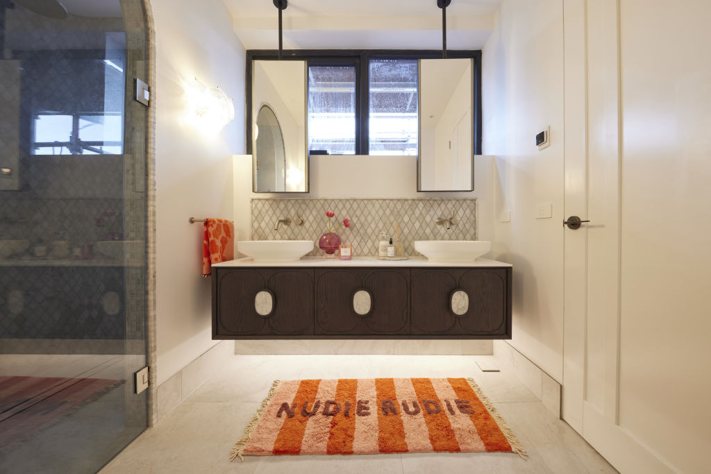
Shaynna took issue with the styling, saying, “I find the styling so childlike that it takes it down a notch” – and when it comes to styling a high-end master en suite for sale in this market, we agree.
Thankfully, a simple switch out of the towels and floor mat will give an opportunity to elevate the styling and bring it in line with a more appropriate level of luxury.
House 3: Kristy & Brett (spend $31,608)
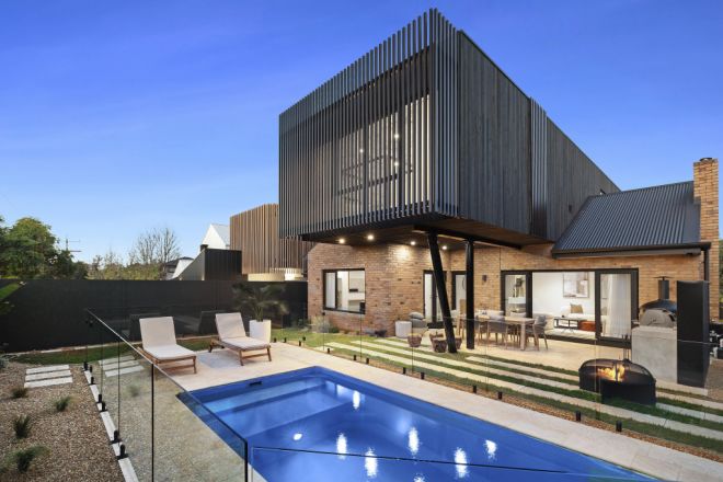
Kristy and Brett were praised this week for delivering an en suite where functionality hit the brief. Darren even said, “You cannot fault this layout,” and awarded them a joint equal win with the girls in House 5.
The judges were also excited to see the shower grate drain placed closer to the back shower wall than the previous two en suites they’d inspected.
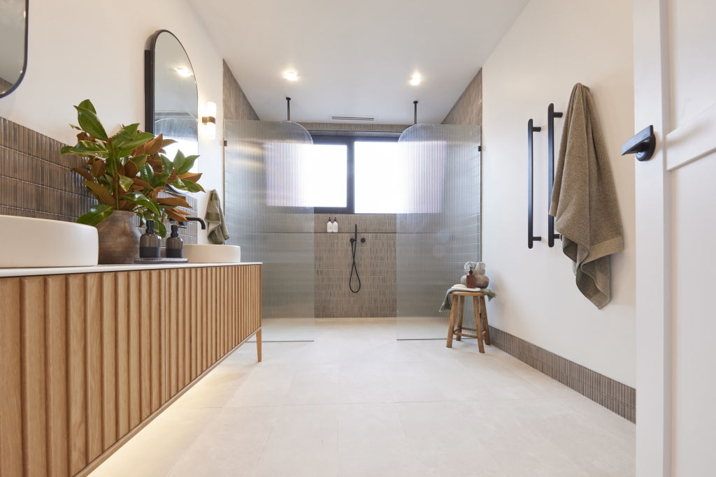
This en suite flows well stylistically from Kristy and Brett’s master bedroom and downstairs bathroom, with a similar colour palette and tiles used. They’ve saved in their budget this week by tilling only in the shower wet area, vanity splashback and skirting tile.
However, we personally feel that Kristy and Brett have missed an opportunity to use a warmer wall colour, which would have looked more high-end than the stark contrast they have been left with between their tiles and the white walls.
House 4: Steph & Gian (spend $31,753)
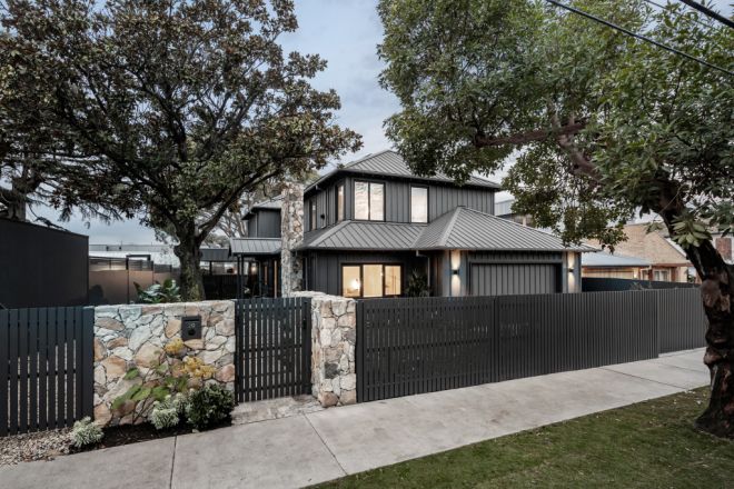
Steph and Gian’s bathroom evoked mixed responses from the judges this week.
Shaynna noted there is “a definite consistent aesthetic” in line with their Japandi style throughout the rest of the home, Darren loved the James Hardie panelling that will also be used on the facade of the home, and Marty went so far as to say the bathroom made him feel as though he was in a “quarantine facility”.
We do agree with Darren and love the use of the panels, but we feel it would have been sufficient on one wall alone. The use of the fine texture cladding on both walls feels very clinical to us.
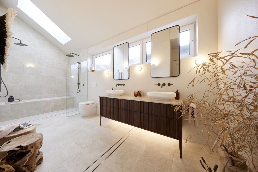
Overall, we love individual elements of this bathroom but feel there are errors in the functionality and application of certain materials, such as the placement of the vanity and toilet underneath the window and the fine texture cladding on opposing walls.
None of these decisions alone are a complete failure, but this bathroom feels somewhat of a disappointment considering their amazing bedroom and walk-in robe.
House 5: Eliza & Liberty (spend $29,662)
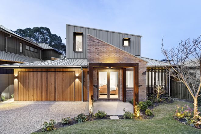
Eliza and Liberty delivered a luxe and sophisticated en suite this week, earning them equal first place, with Marty’s first words being, “This is spectacular.”
The judges noted that the floor plan was “near perfect” and that the bathroom felt resolved and really well designed, with the only negative feedback that all three judges felt the face-level storage cabinets were a fraction too high.
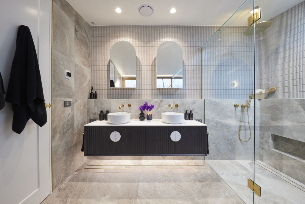
Overall, we believe Eliza and Liberty’s bathroom was worthy of the win this week. The tile choice and material selection felt balanced, harmonious and worthy of a high-end master suite.
Results
1st – House 5: Eliza and Liberty and House 3: Kristy and Brett with 28 points
2nd – House 2: Leah and Ash with 23.5 points
3rd – House 1: Kyle and Leslie with 22.5 points
4th – House 4: Steph and Gian with 21 points


We recommend
States
Capital Cities
Capital Cities - Rentals
Popular Areas
Allhomes
More

