The Block 2023 granny flat bathroom reveal recap: Kyle and Leslie win week 1 with curves, sans nightclub vibes
Introducing the first of our recaps from our expert panel of ex-Block contestants, who will this year get to spend room reveal night judging from their couch rather than standing on the proverbial chopping block before Scotty Cam. This week, 2022 contestant Rachel Carr, who appeared on the Gisborne tree-change series with her husband Ryan, dissects the very first room reveal of Season 19, 2023.
Well, hello, my fellow Block lovers!! We are back for another rollercoaster Block series, and let me tell you, it is so incredibly nice to be sitting on the couch on a Sunday night, ooohing and ahhing and downright judging with the rest of you.
This season looks like it’s going to be a ripper. We’ve had our 48-hour House Decider challenge, some surprise reveals from Scotty, my good mate Tom is back and is leading up the hipages team, and we have a new judge in the legend that is Marty Fox.
Marty was our auctioneer; with almost 15 years worth of real estate experience, his knowledge is invaluable to these contestants, and we’ve already experienced a little of that Block drama, which has come surprisingly early this season (could this be a taste of what’s to come).

We’re kicking off our first room reveals with granny flat bathroom week! Some of the contestants believe they have delivered things we have never seen before (curves and Venetian plaster – groundbreaking right?).
Others aren’t quite sure what they’re doing, but seem to be getting it almost right in my opinion – so here we go team, Week 1 of The Block 2023.
HOUSE NO. 1 KYLE AND LESLIE – spent $29,592
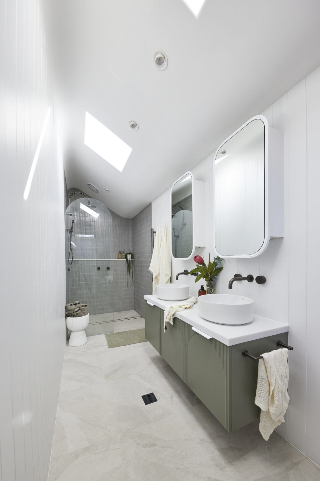
Kyle and Leslie are our quiet contenders, but from what they have delivered this week, I believe these guys are the ones to watch.
They have a few secret weapons up their sleeve – and I do mean weapons. Welcome back to the famous Cursio Brothers.
Adrian Cursio recommends a double curved ceiling to give the illusion that the room is round, and I melt into my chair, but let’s see what our judges think.
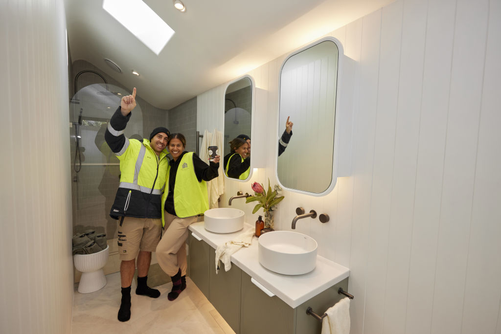
It’s gasps all-round from our experts, as Darren mentions the elegance of the curved ceiling, and Shayna notes the quality of the work done.
Marty praises the layout, specifically the storage, length and the privacy of the toilet, and explains how beautifully the room will shoot from a marketing perspective.
But it’s not all sunshine and rainbows. The placement of the drain is odd to Shayna, the lack of underfloor heating stumps them (I completely agree here!), but overall they love the feeling of this bathroom and the ceiling is called out as being the memorable hero of this space.
HOUSE NO. 2 LEAH AND ASH – spent $19,484
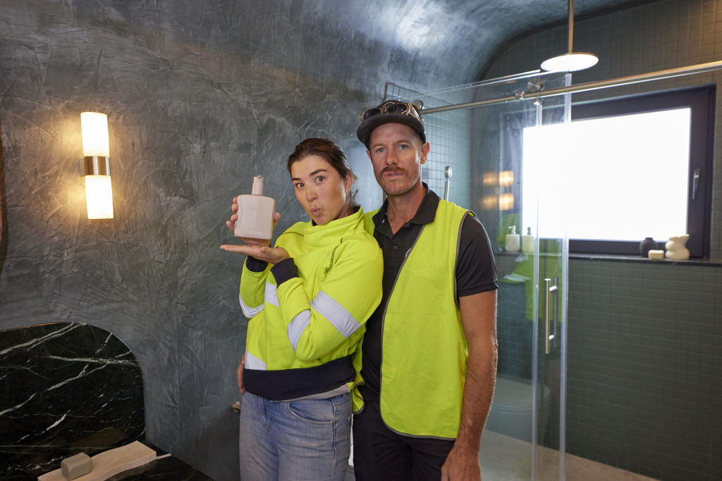
The not-so-quiet Leah and Ash have also gone for what they believe to be completely unique and never before seen on The Block – a curved ceiling. Who’s going to tell them?
They are also introducing a dark Venetian plaster over the entirety of the bathroom, calling it sexy, hot and steamy – but will our judges agree?
A wow from Marty followed by the comment “curved again” and the judges are quiet as they take in what is then labeled as, “a lot. Like, A LOT”.
Marty feels like he is in a nightclub and I have to agree entirely; the LED strip lighting and those dark polished walls are screaming 2am in Sydney city to me, and we all know nothing good happens after 2am.
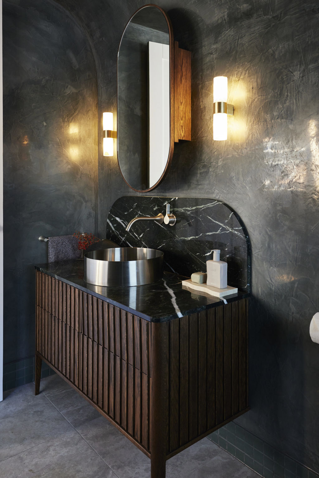
Darren, however, loves it and says, “it looks hot”.
Shayna is caught between the sentiments of her male counterparts, agreeing with both in that she loves it, but also finds it polarising.
The judges warn that this style should not be carried through the house, to which Ash and Leah assure Scotty that it won’t be.
Darren confirms that Leah and Ash should continue with their boldness, but Marty questions whether “the boldness brings in the biscuits”.
HOUSE NO. 3 KRISTY AND BRETT – spent $17,534
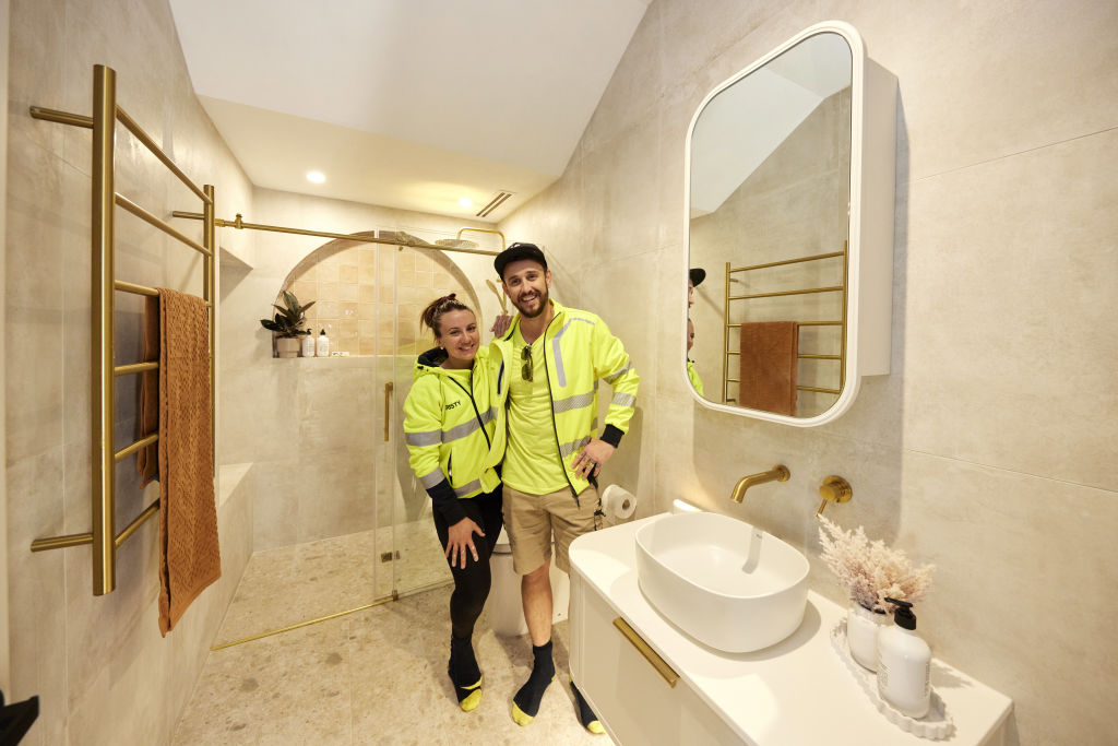
And we’ve arrived at House 3 with Kristy and Brett, who have decided to go in a different direction to the curves of houses 1 and 2, instead presenting a feature – “drumroll please” – ARCH.
Kristy tries to get Venetian plaster but can’t, and I personally think this is a win.
We’ve seen it, your neighbours did it and I don’t think it worked for them, in my humble opinion. But here come the only three opinions that matter right now: our fearless judges.
And we start off well because they feel like they’ve entered a Moroccan day spa.
Shayna notes the beautiful arch and bench seat in the shower, but says it’s being fought by an industrial shower screen.
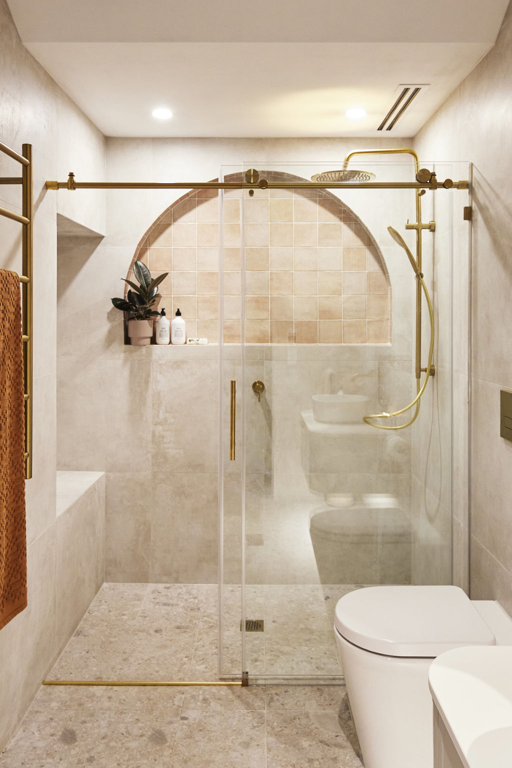
Doesn’t sound great, but the real hitter is Marty who labels the bathroom something I’ve definitely heard before: “bland”.
Shayna agrees with the bland comment and the negatives keep coming: lack of natural light, cold space, and then the tiling making it worse.
Marty thinks the room won’t put off buyers, but it’s also not memorable either.
There’s no emotional connection and I speak from experience when I say that’s a dagger to the heart.
Darren mentions there are three styles to the bathroom, and these three styles haven’t been put together correctly by Kristy and Brett.
Shayna’s final words of wisdom is to “get your vision right, get your market right, and know your client … and then … it will all come together”.
HOUSE NO. 4 STEPH AND GIAN – spent $21,895
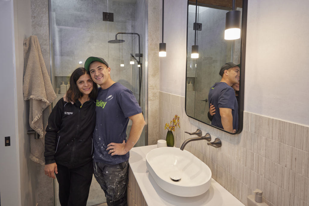
Welcome to House 4 with our young lovers, Steph and Gian.
Steph is an architect and Gian is … I actually can’t remember but I am 100 per cent certain that Steph is an architect.
After initially demo-ing the wrong room, and a week full of issues, we have their first bathroom presented, and our judges first reaction is A WIN for the planning.
Darren labels it as the best layout of the day. He also loves everything at eye line and below – the tile choices, the colour palette, the vanity – and all is rainbows, sunshine and glitter … until he looks up.
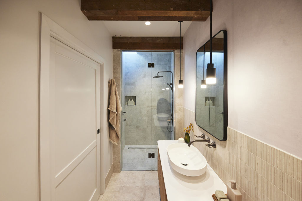
Darren explains that the rustic beams are a “dogs breakfast” and completely out of place (and he is not wrong at all).
All judges note that the execution leaves a lot to be desired and Shayna blames the downfall on the effort spent on those horrible beams.
Marty really hammers it home by saying that no one in 14 years has ever said they love rustic beams.
It’s a lot considering we had beams in our kitchen and everyone loved them, but they do have to be done right – and I agree with the judges, this just isn’t it.
Darren points out we have one unheated towel rail, the powerpoint is in the wrong place, and although some aspects are aesthetically pleasing – the execution is “rubbish” and that’s what they need to work on.
HOUSE NO. 5 ELIZA AND LIBERTY – spent $26,262
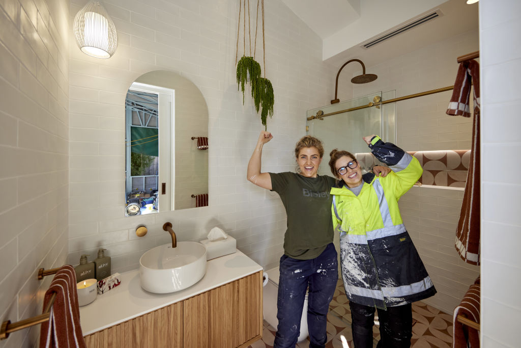
Last but certainly not least, we have our bubbly sisters Eliza and Liberty.
Having spent the vast majority of their time on the show telling us how bad they are, they keep delivering the goods in my opinion.
I love this bathroom. I love the tiles, the textures, the colour palette, the majority of the styling (I’m not big on the hanging plant or that light).
This room to me is a winner. But what do our judges think?
Darren and Shayna are with me on the tiles, and Shayna mentions the feeling in the room is divine and Marty adds that the raked ceiling is very calming.
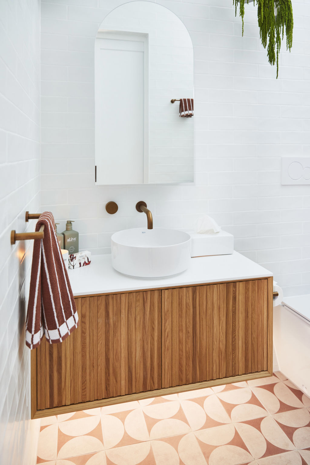
But the mixed metals. I couldn’t see this properly on the TV so I’m glad its being called out because I don’t like a mixed metal.
We’re also shown that this room could have been designed for giants, with the wall cistern and shower head being set too high for the Average Joe.
They also aren’t sold on the shower screen and Darren’s with me on that pendant light: horrific.
But on a positive note, we have the underfloor heating, we have the functionality, the layout couldn’t be any better and we love the ceiling heights.
There’s a lot of ticks here, Marty comments. Execution’s good and, on that note, we all clap and that’s it for feedback on Week 1.
Who will be our winner? It’s between House 1 and 5 for me, but I’m not doing the crowning, our three judges are.
And the winner by a measly half a point is ….
HOUSE 1: KYLE AND LESLIE
Final scores are :
Kyle and Leslie :25
Leah and Ash : 24.5
Kristy and Brett : 21
Steph and Gian : 20.5
Eliza and Liberty : 23


We recommend
States
Capital Cities
Capital Cities - Rentals
Popular Areas
Allhomes
More
- © 2025, CoStar Group Inc.
