The Block 2023: What do buyers want in a granny flat these days?
The way we think about the use of self-contained spaces has shifted dramatically since the pandemic when “studio” became one of the hottest keywords you could attach to a property.
Before working from home became a legitimate “location”, studios most likely housed the Christmas decorations, old clothes and those redundant pieces of furniture we can’t bear to throw out (and a place for the kids to sneak off to to create mischief).
But post-2020, we saw people from Darwin to Dover scrambling to drop a box onto their property that would provide extra space and privacy. And like many trends in Australia, few people did it by halves.
Since the revival of granny flats, demand has soared, and these extra spaces can now add huge monetary value to a property, some $266,000 on the median price compared with homes that don’t have one.


But as to what should and should not be incorporated into a studio, well, as we saw on The Block this week, that is very much open to interpretation.
Do you need a kitchenette? A fridge or a fireplace? What about a TV or a microwave? A Pilates bed or a Murphy bed?
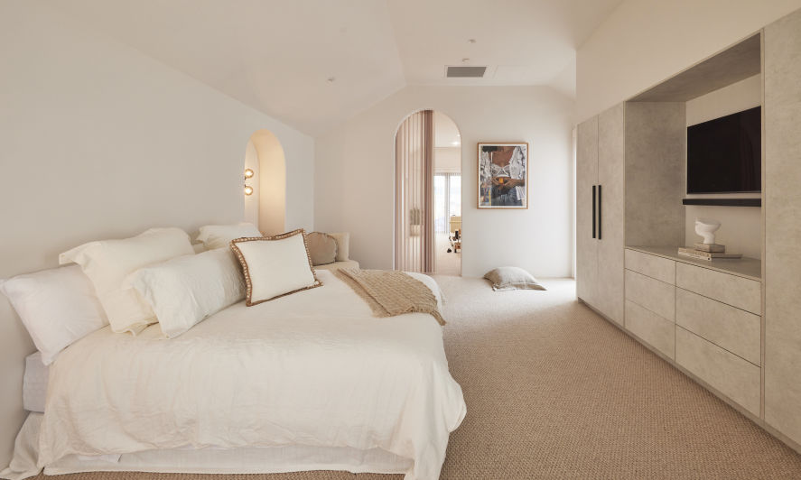
The footprint of Kyle and Leslie’s studio is a whopping 48 square metres – bigger than my entire first apartment! What should have worked in their favour, in some ways worked against them – what do you actually do with all that space?
For my money, given the huge size of their studio, they had the opportunity to actually create a stand-alone unit. An execution like that would have given a future buyer the chance to make decent income by leasing it out, or even one day, the possibility of creating a separate title for the unit and selling it. Ka-ching.
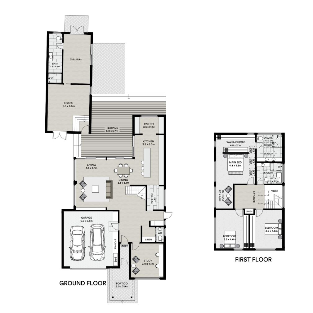
Instead, the space is not quite sure what it is. Beautiful? Undoubtedly. Flexible? No.
The bedroom should have most definitely been at the back. The front space should have been set up as an office. End of story, no further questions.
Normally it would be relatively simple for a buyer to rectify, except in this case, the TV and bespoke joinery are built in, giving this room less flex than it should have in a family suburb like Hampton East.
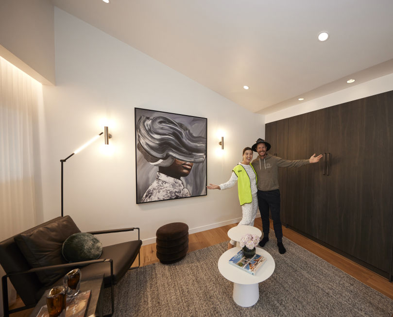
And so, onto the vexed issue of beds! In terms of options, here’s how I see it: a stand-alone bed, a convertible bed or no bed at all.
The winner for me is Leah and Ash with their genius use of a Murphy Bed, aka a fold-down bed. It’s not the Ritz so this space needn’t be either. All it has to do is offer a buyer true flexibility so they have the option of using it as a guest room, a bolthole for a grumpy teen or ignore the bed altogether and set the space up as a home office or gym.
It is the best solution we saw in this week’s reveals.
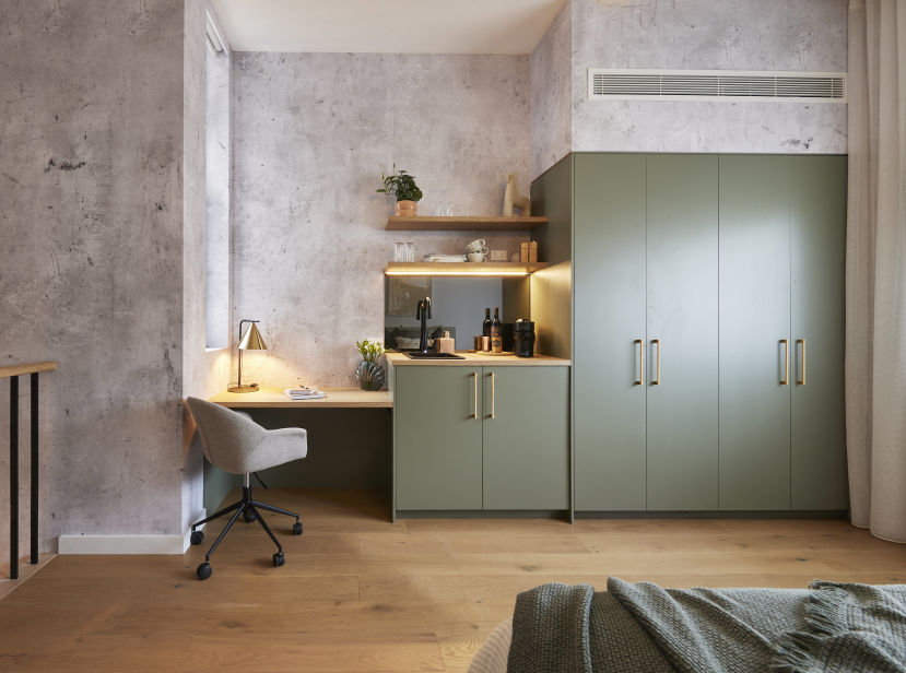
And bravo to Kristy and Brett for their use of skylights, which suddenly gave these self-contained spaces permission to be light and bright. I loved it.
Yes, it needed a bit more styling and ideally the kitchenette would have been tucked away within the joinery, but the bones are there and they’ve given the eventual owners the chance to do more or less with the space, to suit their own needs and situation.
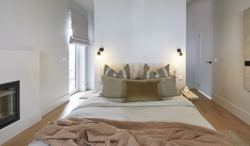
Speaking of which, I would have loved to have seen Steph and Gian use a clever space saving trick in their room, just so it didn’t feel like it was “all bed”. The option of a sofa bed or an actual pull-down bed would have freed up the room.
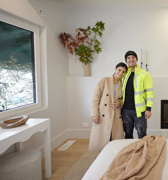
But I know, you can’t have everything. And top marks to Steph for the styling of olive branches outside the window to hide the fact the curtains didn’t fit correctly. I’m filing that one away!
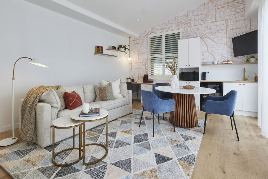
The rookie mistake this week was made by Eliza and Liberty and involved them putting everything and anything into their studio.
These spaces most likely serve as an addition to the main houses … not a whole separate property and, as such, they needn’t be set up as one. Sometimes when it comes to property, it’s what you leave out that can be as important as what you put in.
Ultimately, for me, there is one absolute must that a studio or self-contained space needs: its own entrance. All the houses deliver that.
We can split hairs about microwaves and sinks, along with real beds as opposed to Pilates beds. In reality, in 2023, a property that has a self-contained space with its own private entrance is most likely to be better than the house next door that doesn’t.

We recommend
We thought you might like
States
Capital Cities
Capital Cities - Rentals
Popular Areas
Allhomes
More
- © 2025, CoStar Group Inc.
