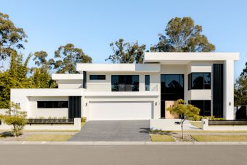
The Melbourne cottage that mixes the old with the new
This single-level Victorian brick house has been transformed into a bijou dwelling for a couple and their toy poodle.
Lisa Webber and her husband have lived in their Hawthorn East home for over 30 years. It was renovated before – in the 1970s and again in the ’90s when a rear extension, including a kitchen, living and dining area, was added along with an external studio. But while the three-bedroom, three-bathroom home was functional and compact, it needed a recent “re-zap”, Webber says.
“Some people hate renovating, but I find it exciting!” she says. The couple lived in a front room of the house during the four-month renovation and “used the microwave a lot”.
The empty-nesters worked with leading designer Lauren Li from Sisalla Interior Design on contemporising the home for their next stage of life.
The dwelling’s footprint was barely modified, but some internal rejigging resulted in two bedrooms and two bathrooms, with two remaining rooms transformed into a study and sitting room.
In the back extension, the floor plan remained the same but was overhauled by Li. On one side is the kitchen, and on the other is the living space and a study nook. “The planning was good, but the finishes and cabinetry needed updating,” Li says.
In the kitchen, the designer swapped the original granite island bench for an extended marble version that reaches all the way to the wall. Its extra length provides space for a wine fridge and plenty of concealed storage. A graphic black pendant light adds flair, and a trio of moulded-ply Gubi bar stools line one side.
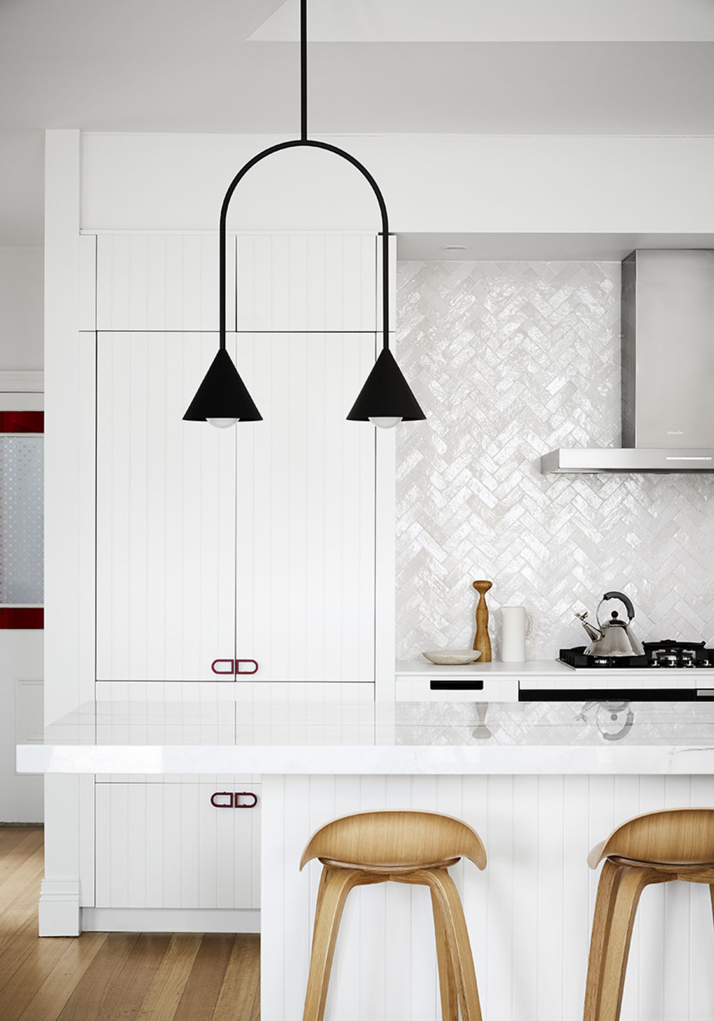
Handmade Moroccan zellige tiles were chosen for the splashback to imbue texture into the all-white space. Slimline Dekton benchtops contrast with banks of seamless cabinetry featuring custom V-groove panelling sprayed with a 2pac finish. A splash of colour is provided by bright-red hardware designed by Li and inspired by the couple’s Andrew Taylor artworks.
“We wanted coloured handles but couldn’t find them,” Li says. “I designed them retro-style, and powder-coated them and applied a similar shade to the inside of some recessed shelving.”
There is plenty of storage, including a walk-in pantry, three whole drawers dedicated to cutlery, an under-the-oven cupboard for baking trays and large drawers for housing pots, which Webber finds more practical than cupboards.
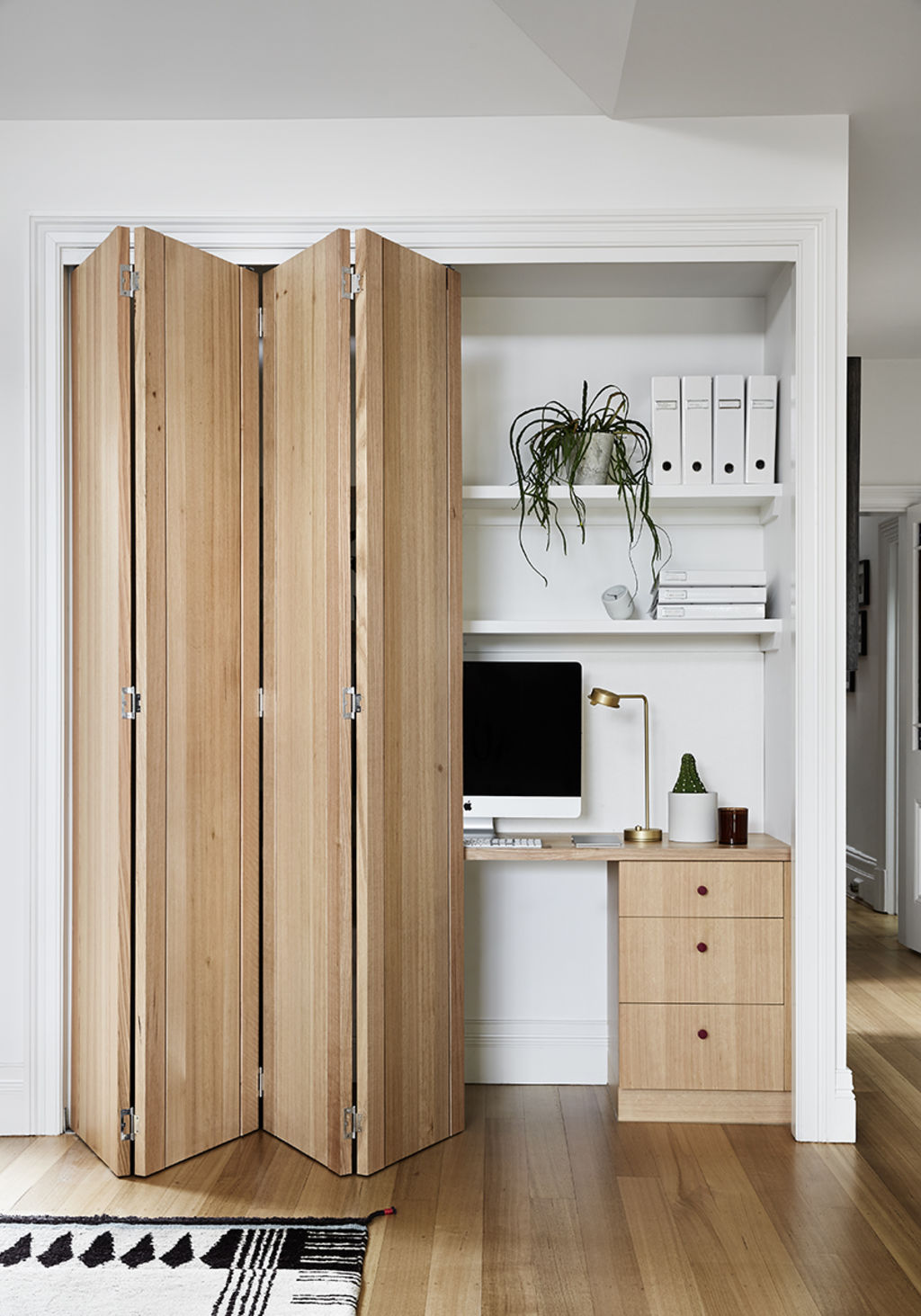
Off to the side, her study nook was updated with fresh joinery in American oak veneer, 2pac shelves and new timber bifold doors. The red powder-coated handles, again, add a touch of colour.
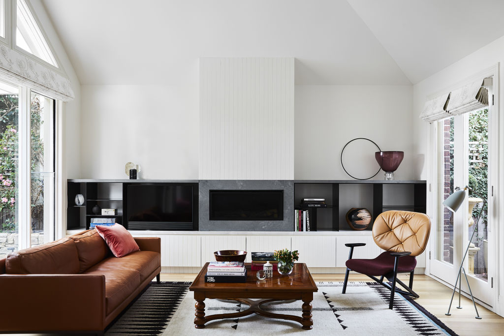
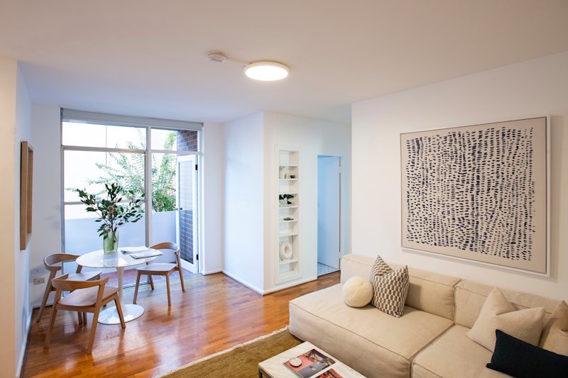
Opposite the kitchen is the living room. Once filled with French provincial furnishings, today it is a combination of old favourites and contemporary pieces. “Lauren didn’t want a mass of new furniture, so it is a combination of old and new,” Webber says. “Once, it was all cream, but with colour, it has been transformed.”
To complement the couple’s original coffee table, Li added a characterful chair by influential Spanish designer Patricia Urquiola. A Domo leather lounge and grey velour Jardan sofa reference the colours of the original Tasmanian oak floors and new fireplace surrounds that include left-over marble from the kitchen and V-groove panelling. “Using the same materials in an open-plan space provides seamless continuity,” Li explains.
In the adjoining dining space, Li retained the couple’s original antique French oak sideboard and dining table, refreshing it with a set of chairs from Jardan.
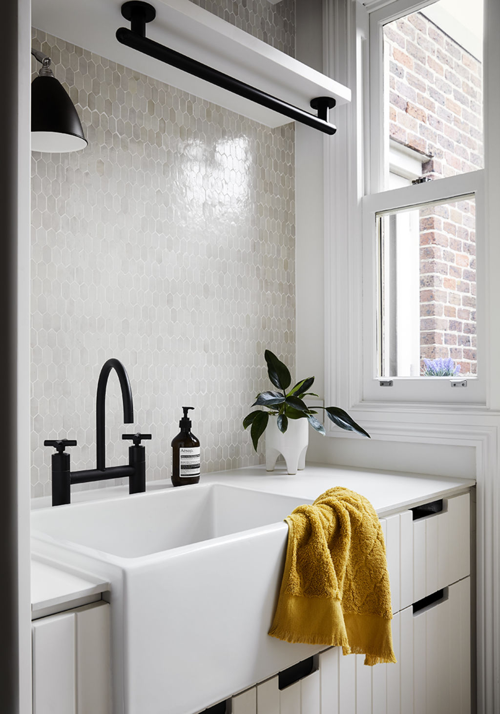
The value of a well-planned space where everything has its home can never be underestimated, and Webber says her laundry is just that. “Every single item has its place,” she marvels. “I often leave the door open because it’s so beautiful!”
The once-blue walls and vinyl benchtops have been replaced with crisp-white routed panelling, a Dekton benchtop and Moroccan tiles. The washing machine and dryer are stacked to allow for more bench space and a capacious butler’s sink. A hanging rail for shirts was crafted from a Bunnings vertical door handle, and Webber’s handheld vacuum permanently recharges in the cupboard.
“I even have a big drawer to keep bits and pieces in, which is so rare in a laundry,” she says.
Li says she is thrilled with the end result. “I am so happy Lisa loves it, and it’s wonderful to see her special pieces incorporated throughout, too,” she says. “It sets the perfect stage for her family and their next stage of life.”
We recommend
States
Capital Cities
Capital Cities - Rentals
Popular Areas
Allhomes
More
