The sands of time

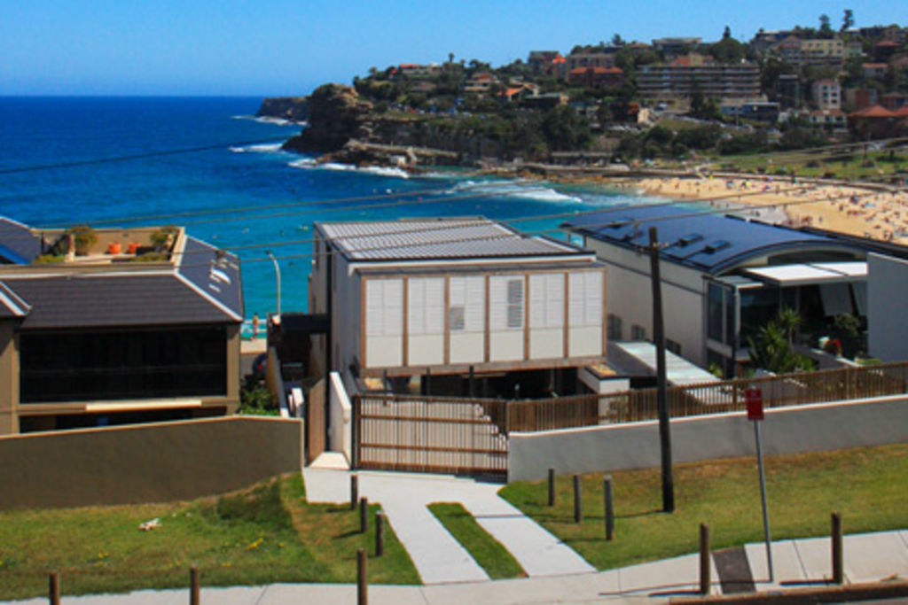
This house in Bronte, overlooking the beach, appears a completely new house. However, the three-level home does have a few pre-existing walls.
Originally built in the 1920s by the owner’s grandfather, the then single-storey house was considerably remodelled in the 1970s.
“My father changed things around in the late ’70s and removed many of the original features,” says owner Richard Raine, who lives in the house with his wife, Tanya, and their two teenage children.
While the site offers unparalleled ocean views, the house as it stood didn’t take advantage of its position, perched on a hill.
“There was really nowhere for the children to have their friends. And we wanted our own space to entertain friends,” Raine says.
“We also wanted a contemporary beach house, not a house that felt more at home in Tuscany.”
Transformed
The modest single-storey house, with basement garage, has been transformed into an almost completely new three-level home, designed by Custance Associates and project-managed by Raine.
The initial intention was to retain as much of the original building as possible but the footings were badly damaged. “The brick ‘ties’ had disintegrated and we were forced to reconsider our approach,” says the director of the practice, architect Craig Shelsher.
Only a couple of walls in the basement were kept, with new sandstone walls anchoring the house to the site, which slopes 10 metres from back to front [access from two streets].
“The sandstone complements the sandstone of the headland,” says Shelsher, who extended the basement to include parking for three cars, a rumpus room and a study. To ensure access was possible from the back street, Shelsher provided off-street parking for an additional car. The concrete floor of this space protects the deck below.
Built for the site
As the Bronte house is on an exposed coastal site, taking the brunt of the southerly winds and salt air, Custance Associates used robust materials. As well as the sandstone base, the walls are rendered brick, painted white, timber and zinc, the latter used for the front door and canopy.
“We wanted to use materials that hold up in relatively severe conditions. But some of the materials were also present in the original 1920s home,” Shelsher says.
To emphasise the elongated nature of the site, Custance positioned the front entrance to one side of the property. A double-height space in the lobby allows a moment’s breather, as well as creating separation between the two living areas at ground level and the bedroom wings on the first floor.
“Richard and Tanya wanted a degree of separation between children and parents. But they also wanted the spaces to appear fluid,” says Shelsher, who sees this void as being the “lungs” of the design. Hot air is drawn up and purged through highlight louvred windows during the warmer months, not dissimilar to the “Venturi” system. And during winter, large timber sliding doors framing the two living areas ensure heat doesn’t escape.
Living space
At the front, on the first level, are the open-plan kitchen, dining and living areas, all leading via glass doors to a generous terrace.
Framed with toughened-glass balustrades, the front terrace offers spectacular views of Bronte Beach and the ocean. At the back is a pool room, leading to a covered area with a built-in barbecue.
“We tend to gravitate towards the rear deck if it’s too windy,” Raine says.
Increased protection at the front of the house was on the architect’s agenda. And although a roof was planned for the timber pergolas, the owners have left the timber columns exposed, to weather a silvery grey.
“We were going to clad the pergola with a series of timber screens but the orientation is predominantly southern and our clients enjoy the exposure to the elements,” Shelsher says.
In contrast to the southern facade, the northern elevation is more enclosed. Operable timber shutters, enclosing a balcony, diffuse light to the children’s bedrooms on the second level. The deep overhang of this level protects the deck.
“This balcony was designed to extend the children’s bedrooms, particularly during the warmer months,” Shelsher says.
Raine adds: “We wanted the house to be flexible, not just for now but well into the future. This house is extremely relaxed and user-friendly.”
Aim
To create a family home that offered flexible spaces that could be easily reconfigured.
How long?
About nine months to design and obtain council approval. One-and-a-half years to construct.
Favourite features
The large terraces, both back and front, which are ideal for entertaining friends and family.
Green points
Rainwater tanks.
Cross-ventilation.
Rooms can be closed off during the colder months to reduce energy costs.
Use of recycled timbers.
Insider’s tip
All parties need to agree on the design well before construction starts. Changing the design later will ensure the budget cannot be adhered to.
Architect
Custance Associates
Builder
RPB Construction
We recommend
States
Capital Cities
Capital Cities - Rentals
Popular Areas
Allhomes
More


