Tips to avoid pitfalls when revamping your home
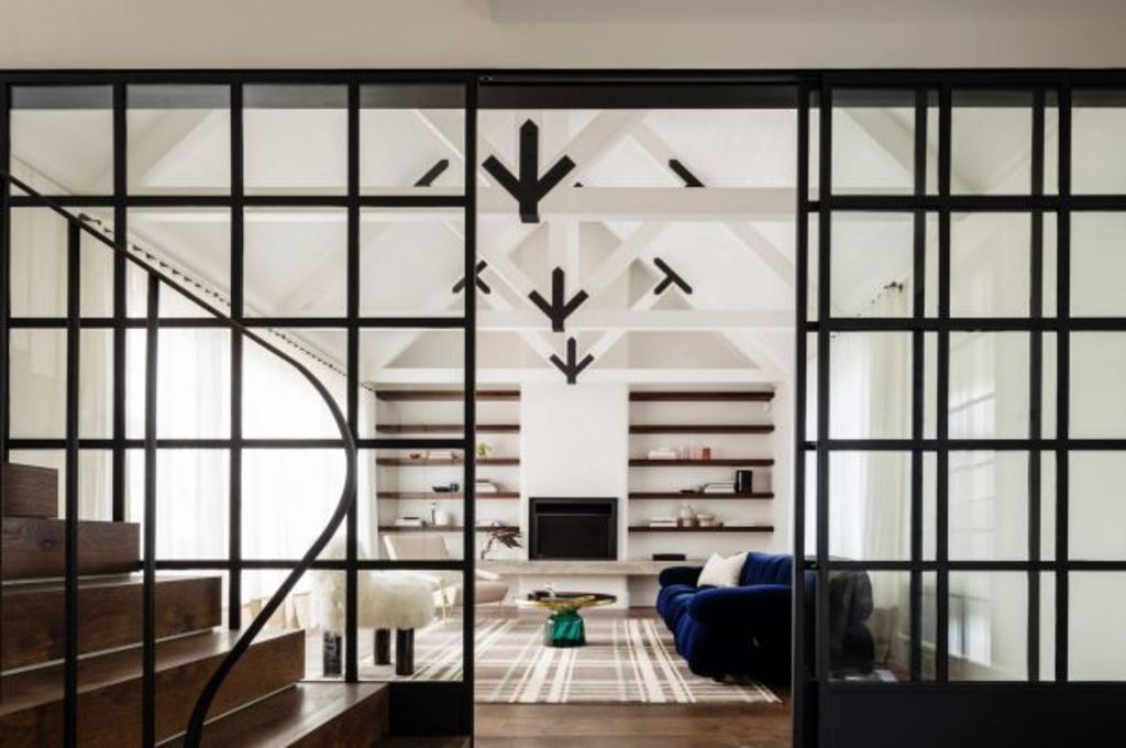
If property is one of the biggest financial commitments you’ll make, then renovating and extending – with costs ranging from $250,000 to well, the sky’s the limit – is likely to be your second biggest lifetime outlay.
From a rosy distance it appears an exciting adventure in architecture. But having seen hundreds of refurbished houses and met similar numbers of designers and clients, I’m aware of the minefield of mistakes that too often catch out the uninformed.
The first and most critical is:
Get real
About the site, the budget, the scale of additions and that any relationship with an architect or designer is a little marriage. With snags in council planning, it could take years, so best if you get on well.
Choose carefully
Track down a designer whose work you have experienced in 3D and have genuinely felt comfortable in. Don’t necessarily go for the trendy names you’ve seen in magazines because we inhabit rooms, not photographs.
You can often visit a designer’s own homes or their past projects to confirm, firsthand, that you really like their work.
Not all designers have taste
An aesthetic sensitivity is not inborn. I’ve been rendered speechless by a huge addition to a glorious Federation villa that was inspired by a sheep-shed. The interior fit-out gave a third personality to an irredeemably butchered house.
Keep an open mind
Yes, it’s your money, but the worst outcomes result from clients engaging a professional and then either bullying them or overruling their educated suggestions. The best outcomes occur when both parties listen to each other, compromise and gently negotiate ideas. A collegiate relationship is more fun anyway.
Luigi Rosselli’s lovely Balgowlah Balancing Houseresulted from a close dialogue with a client who wanted comfortable “rather than magazine sterile”.
Scaling down not up
The shakedown question after presenting your wish list is “do we really need all that space?” I’ve been in ridiculously overscaled houses with new rooms the owners don’t have a use for.
Modern residential design is progressively contracting for sensible and sustainable reasons. Along with a new tribe of young architects who’ve got the message in university that big doesn’t equate to liveable, Melissa Bright, of Make Architecture, has been leading the case for smaller, saner houses that have multi-functioning rooms.
She has often pushed back on a requested footprint to leave room for a backyard of usable size. Her award-winning Local House in St Kilda is a case in point.
Scale is, of course, subjective. How can you gauge your need for well-fitting personal space? Measure a room in which you do feel entirely comfortable. For amateurs it’s an easier way to read space than on plan. And there are those kinaesthetically memorable rooms that feel just right. Take a tape and measure precisely why such a room works in terms of width, length and height.
Building designers are in the game too
They’re the alternative to registered architects and they’re often very user friendly. In this year’s Building Designers of Victoria Awards, Luke Middleton, of EME Design, took out five major prizes, including for an apartment block, and another for a sweet, Brunswick single-fronted wooden house, Cathedralette, contrived to fit into a Melbourne street of wooden single-fronters.
The charm is in the detail
Charm and intrigue in a house is not wow factor. It is the incidental discovery of brilliantly functional innovations. Detail should be about function, not fashion.
Check the tilt-out plantation shutters on Hugh Campbell’s re-imagining of an Alexandria workers’ cottage in Sydney’s inner west. They work for privacy and ventilation. Notice, too, the contemporary, square dormer windows so conversant with their setting.
Imagine experiencing the gorgeous greenhouse bathroom with overhead skylight that Breathe Architecture’s Daniel McKenna inserted into a Surry Hills, Sydney, terrace in place of the outdoor shower the owners wanted.
It’s the microcosm example in Double Life House where all of the above-mentioned criteria were fulfilled. They tracked down a Melbourne architect whose work they admired, all parties listened to each other, the work was quirky (them), inventive and perfectly-scaled (McKenna), and all went smoothly.
The result: a reborn old house that so successfully works every potential of its tight site it emerged as a multiple award-winning residence of notable originality.
We recommend
We thought you might like
States
Capital Cities
Capital Cities - Rentals
Popular Areas
Allhomes
More

