Twin-peaks house renovation subtracts 1980s style and adds new curves
Related stories
In discussing the effects of his remediation and “infill” addition that added an exceptional new entry to a twin-gabled Queen Anne house overlooking Sydney Harbour, Luigi Rosselli keeps it all sotto voce.
He quotes the Roman architect and writer Vitruvius “who said that architecture is to put on and remove, to add and subtract. I just tried to achieve a good balance”.
To make her father’s house with the 1980s rear additions that afford those “only-in-Sydney” Harbour outlooks into a home for her young family, the client engaged the local architect whose great joy is working with old buildings. “If they’ve got some character”, Rosselli tells, “my passion is to pull out those characteristics as much as possible”.
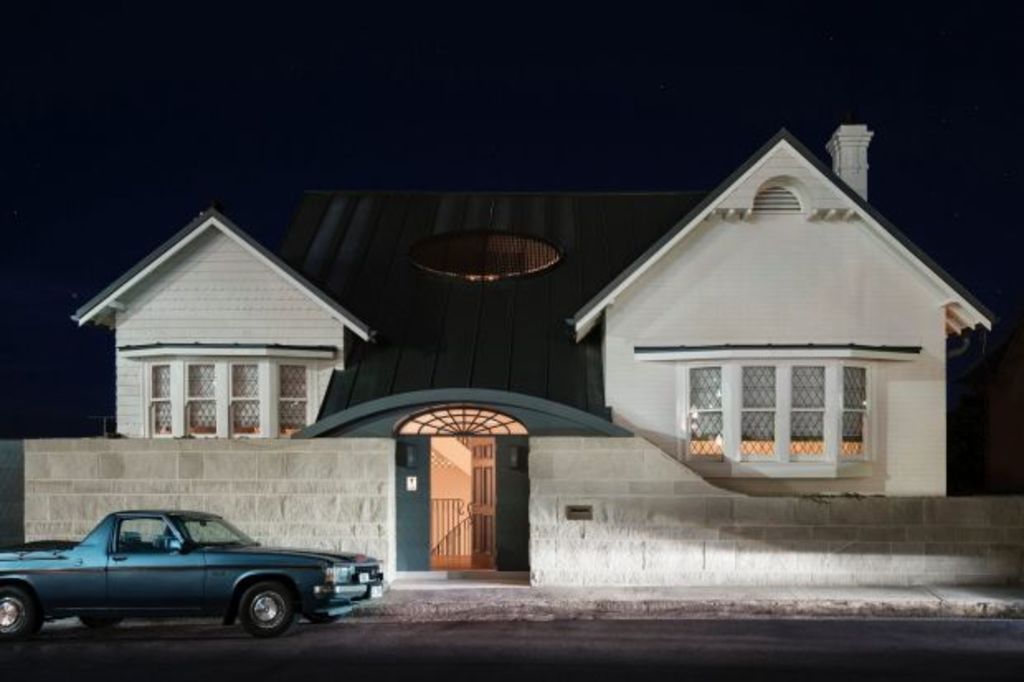
Rosselli and his team brought the roofline at the front all the way to the gap in the new grey sandstone wall so it incorporates into the building what had been an awkward, steeply descending front courtyard.
In doing so, they have introduced an elegance suggestive of regency styling. Regard that stylised fan light? The Woollahra council acquiesced to Rosselli’s request to do something as unusual as a pavement step-in foyer and, as a result, the street hasn’t lost a nice period house but has gained a gorgeous new composition in curvature.
The house lost its difficult courtyard but gained a stairwell where all the elements, including the light feed from the new, roof-set oeil window, are curvaceous.
In places where windows had been in the former facade, openings were amended and then in-filled with screens made up of stacked terracotta tiles painted white. These “fish-tail screens” – an age-old motif, says Rosselli – are there “so from the street you can’t look straight into the house”.
In the three-level atrium that rises to the new attic playroom-study and via the middle bedroom level down to the living spaces in the lower floor, the screens are now the backdrops to a sinuous staircase the architect underplays as a “simple, black steel balustrade design”.
But along with his replacement steel windows, such supremely graceful staircases are a Rosselli signature. “I’m not the only architect who enjoys staircases because they are sculptures,” he says. As part of a total effect at the intro point of the client’s forever house, “we didn’t try to make it ostentatious or grand … not too Hollywood or theatrical.
“The idea was to just get light in and to join the various levels in a fluid way”.
While one rear wing was removed to free up outdoor space, another was retained but given suitable refinements; curves (naturally) and ultra-fine balustrades on “those wonderful outdoor terraces” with those wondrous water views.
We recommend
We thought you might like
States
Capital Cities
Capital Cities - Rentals
Popular Areas
Allhomes
More
